In my years of helping homeowners create beautiful and functional living spaces, I’ve observed that beige and grey color combinations offer something particularly valuable—the ability to create environments that feel both sophisticated and genuinely livable for daily family use.
The challenge lies in implementing these neutral tones thoughtfully so they enhance rather than bore, creating spaces that remain visually interesting while providing the calm foundation that many families seek.
Through various neutral living room projects, I’ve learned that successful beige and grey implementation depends on understanding how different shades, textures, and proportions work together while considering practical factors like lighting conditions, furniture durability, and maintenance requirements.
I’ve seen expensive neutral rooms that felt flat and uninspiring because they lacked sufficient contrast or texture, and I’ve learned to prioritize approaches that create visual depth while maintaining the serene quality that draws people to these colors.
These 29 beige and grey living room ideas represent approaches I’ve found effective in creating spaces that balance sophistication with warmth and practicality, each offering solutions for different room sizes, lighting conditions, and lifestyle needs.
Note: For any structural modifications, electrical work, or installations mentioned in this article, always consult with licensed professionals to ensure safety and code compliance.
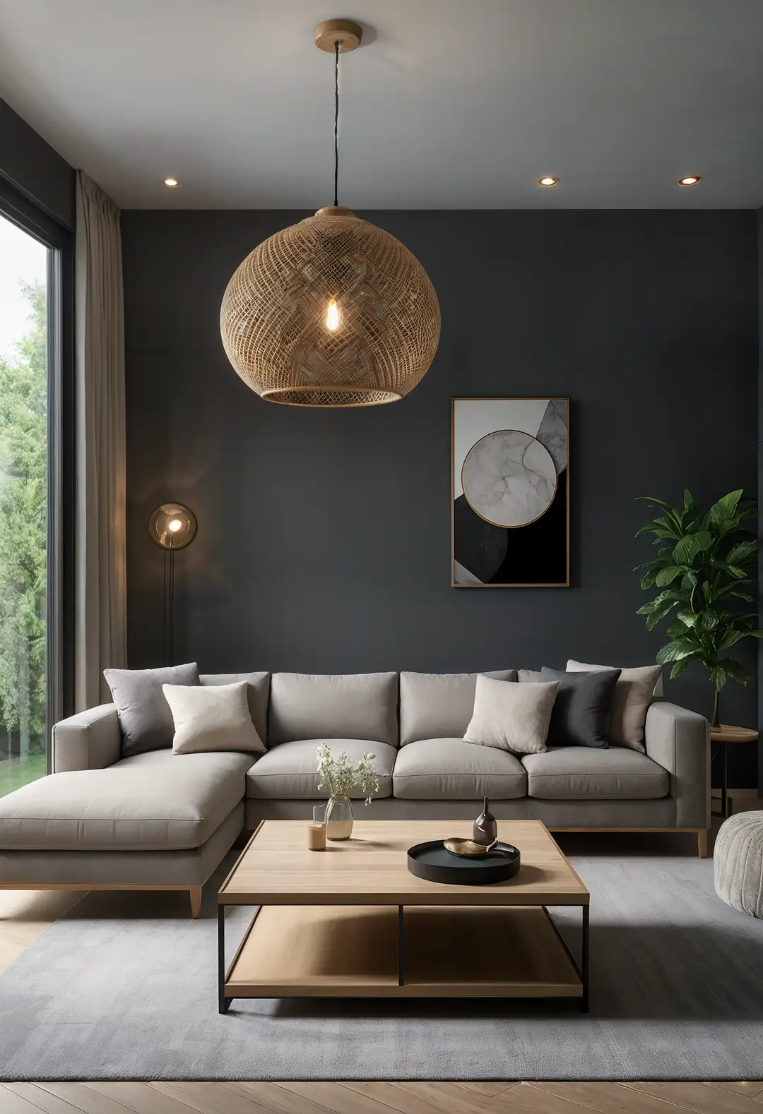
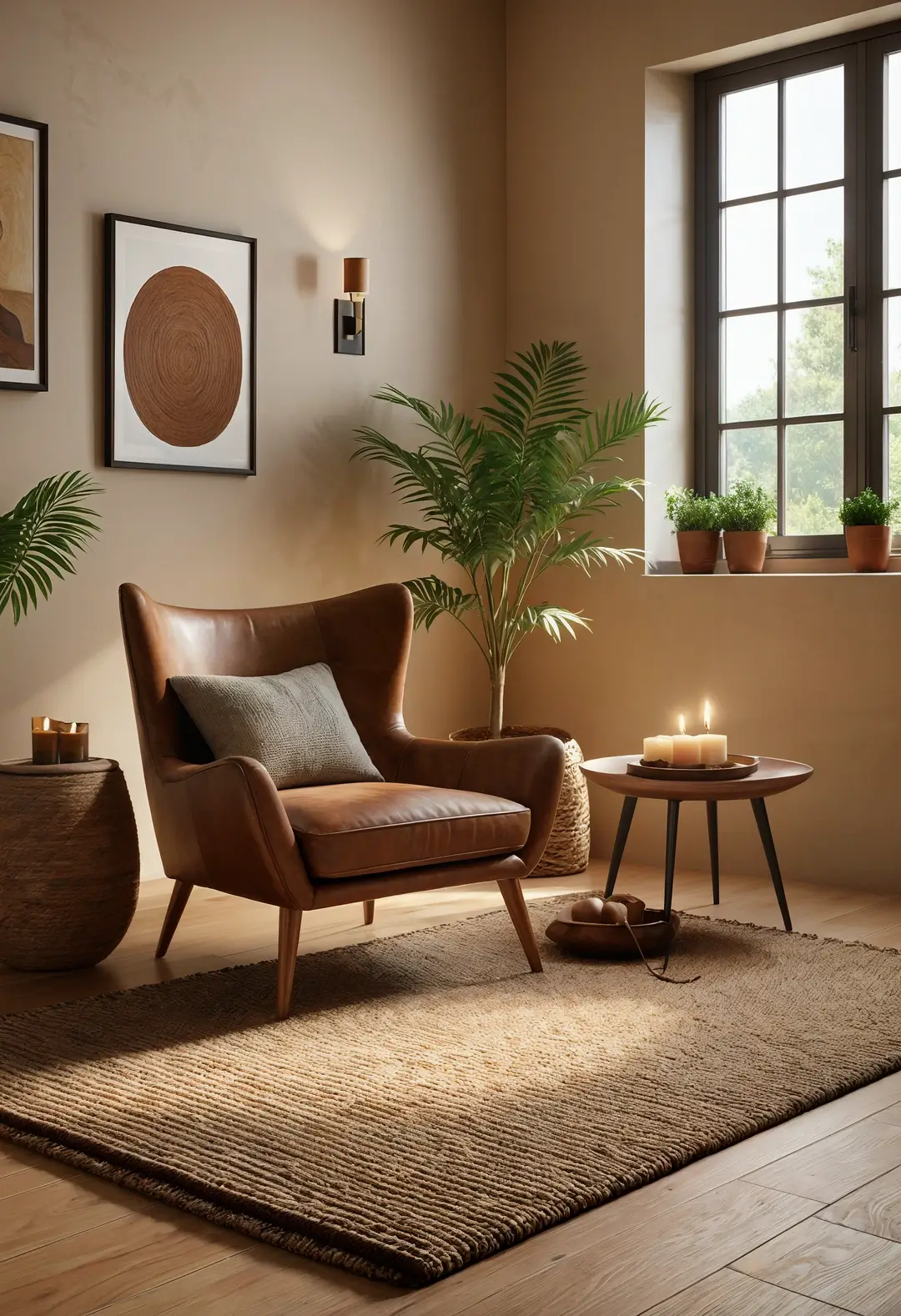
1. Warm Beige Foundation with Cool Grey Accents
This approach demonstrates how contrasting warm and cool neutrals can create visual balance. Soft beige walls can provide a welcoming foundation while grey accents through textiles and accessories add sophistication without overwhelming the space.
Metallic elements like gold or brass can enhance the warmth of beige while providing luxury touches. The combination often works well in rooms with good natural light that can showcase the subtle color variations.
Color temperature balance: Successful neutral combinations typically require balancing warm and cool undertones to prevent spaces from appearing flat or monochromatic.
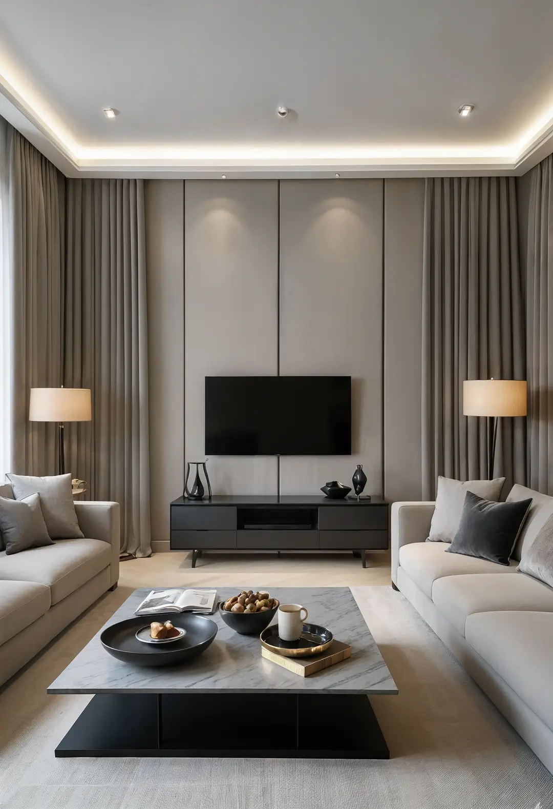
2. Grey Wall Foundation with Beige Furniture
This approach uses darker walls to create sophisticated backgrounds for lighter furniture. Grey walls can provide depth and drama while beige furniture maintains comfort and approachability.
Wooden accents can add natural warmth while preventing the space from feeling too cool or formal. The combination often appeals to those wanting contemporary sophistication with comfortable daily living.
Wall color impact: Darker wall colors can make rooms feel smaller but more intimate, while requiring adequate lighting to maintain functionality.
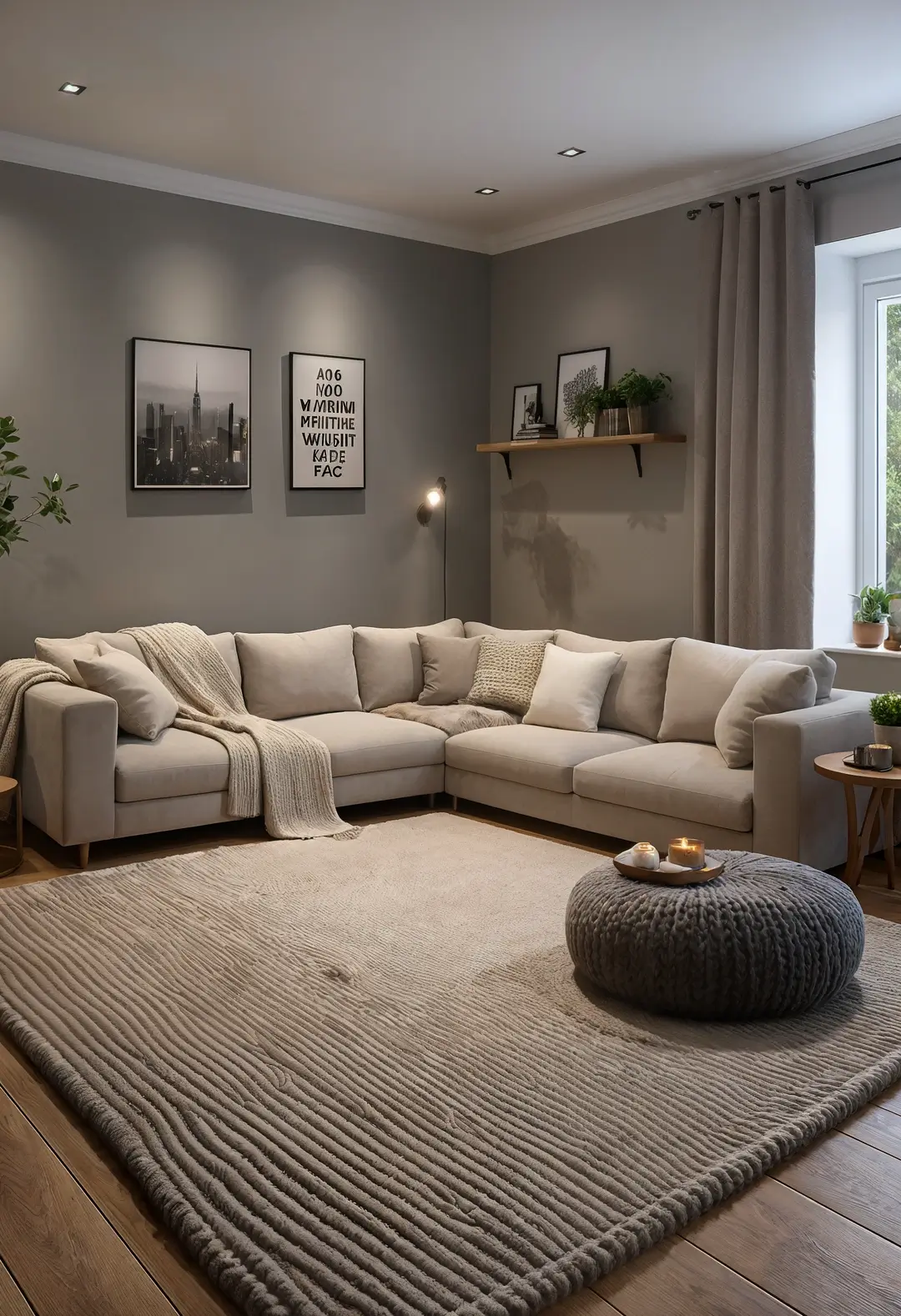
3. Textural Interest with Neutral Foundations
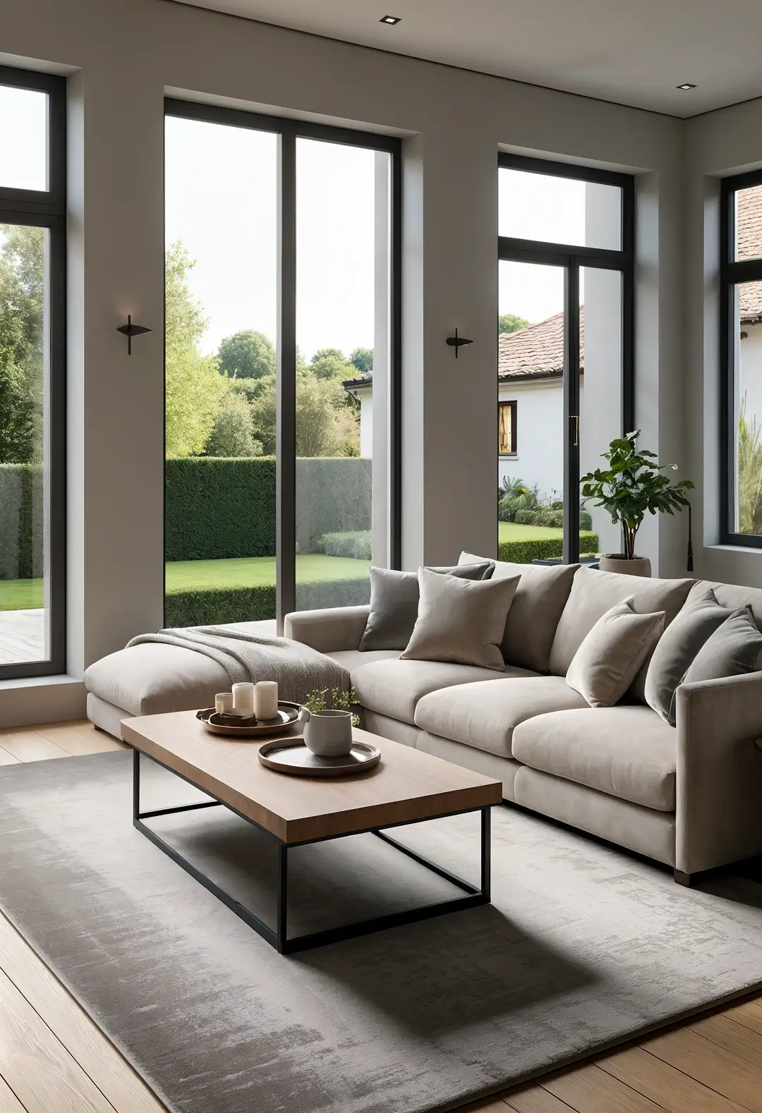
This approach uses varied textures to create visual interest within neutral color palettes. Different fabric textures—velvet, wool, linen—can provide richness while maintaining color cohesion.
Layered rugs and varied cushion materials can add tactile appeal while remaining within the neutral palette. The combination typically works for those wanting sophisticated complexity without bold colors.
Texture strategy: Successful neutral rooms often rely heavily on textural variety to create visual interest and prevent monotony.
4. Neutral Foundation with Bold Art Integration
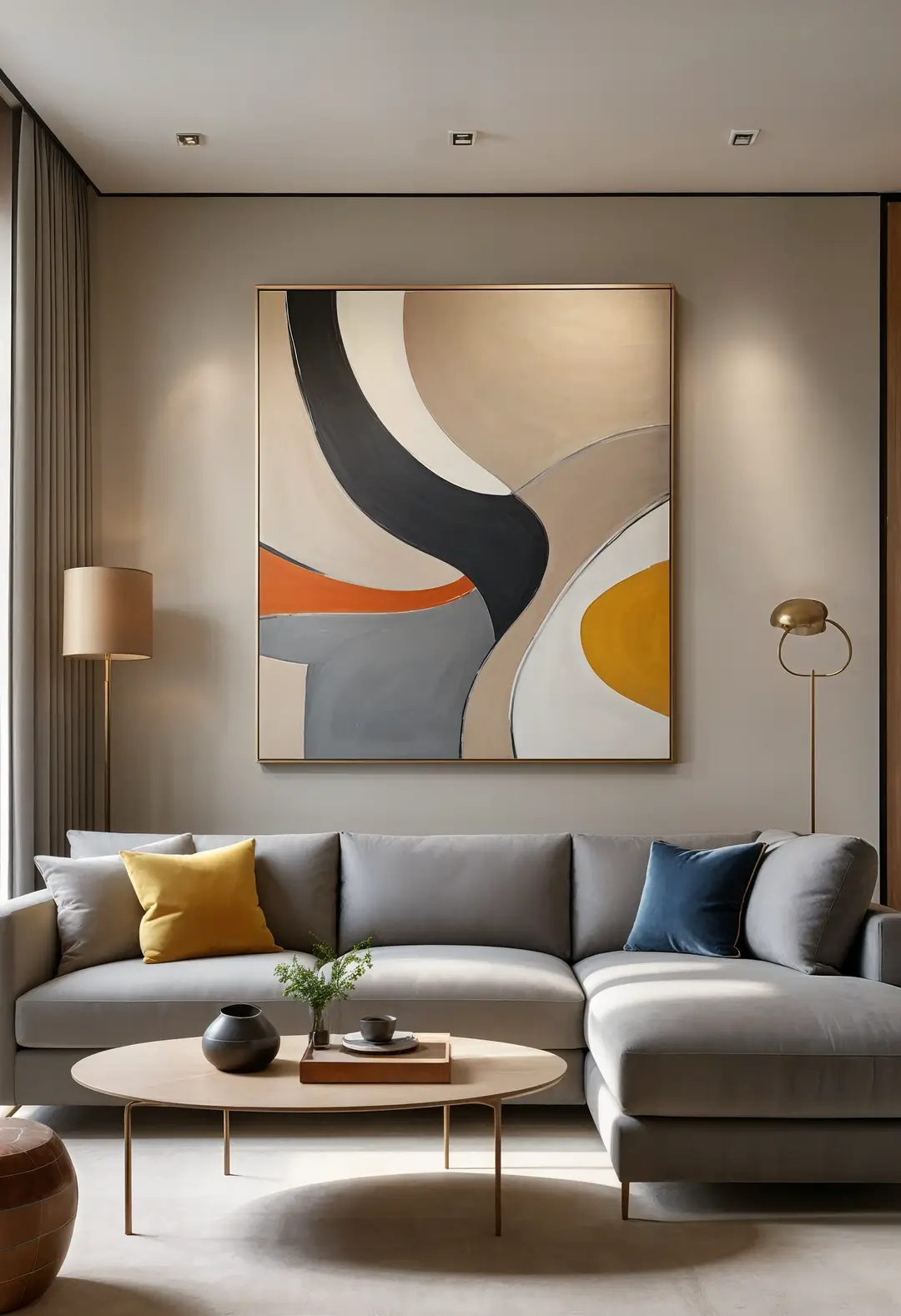
This approach uses neutral backgrounds to showcase dramatic artwork and accessories. Muted wall and furniture colors can provide perfect backdrops for colorful or dramatic art pieces.
The neutral foundation allows for easy art rotation and seasonal changes without requiring furniture replacement. The combination often appeals to those wanting flexible personal expression within sophisticated frameworks.
Art display benefits: Neutral backgrounds typically showcase artwork more effectively than bold wall colors, allowing for greater collection flexibility.
5. Minimalist Neutral with Clean Lines
This approach emphasizes clean design with restrained color palettes. Simple furniture forms and uncluttered arrangements can create serene, contemporary environments.
Glass and metal elements can add contemporary sophistication while maintaining the minimal aesthetic. The combination typically works for those preferring organized, calm environments with easy maintenance.
Minimalist considerations: Successful minimal designs often require high-quality pieces and excellent proportions since each element becomes more prominent.
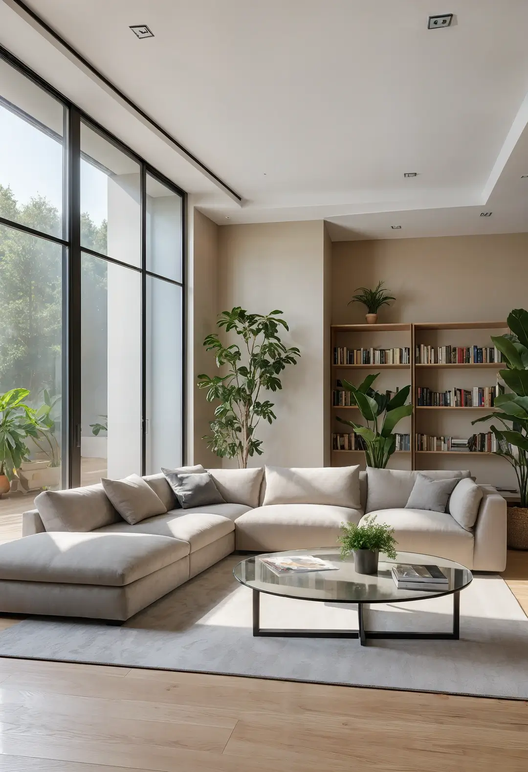
6. Natural Element Integration with Neutral Base
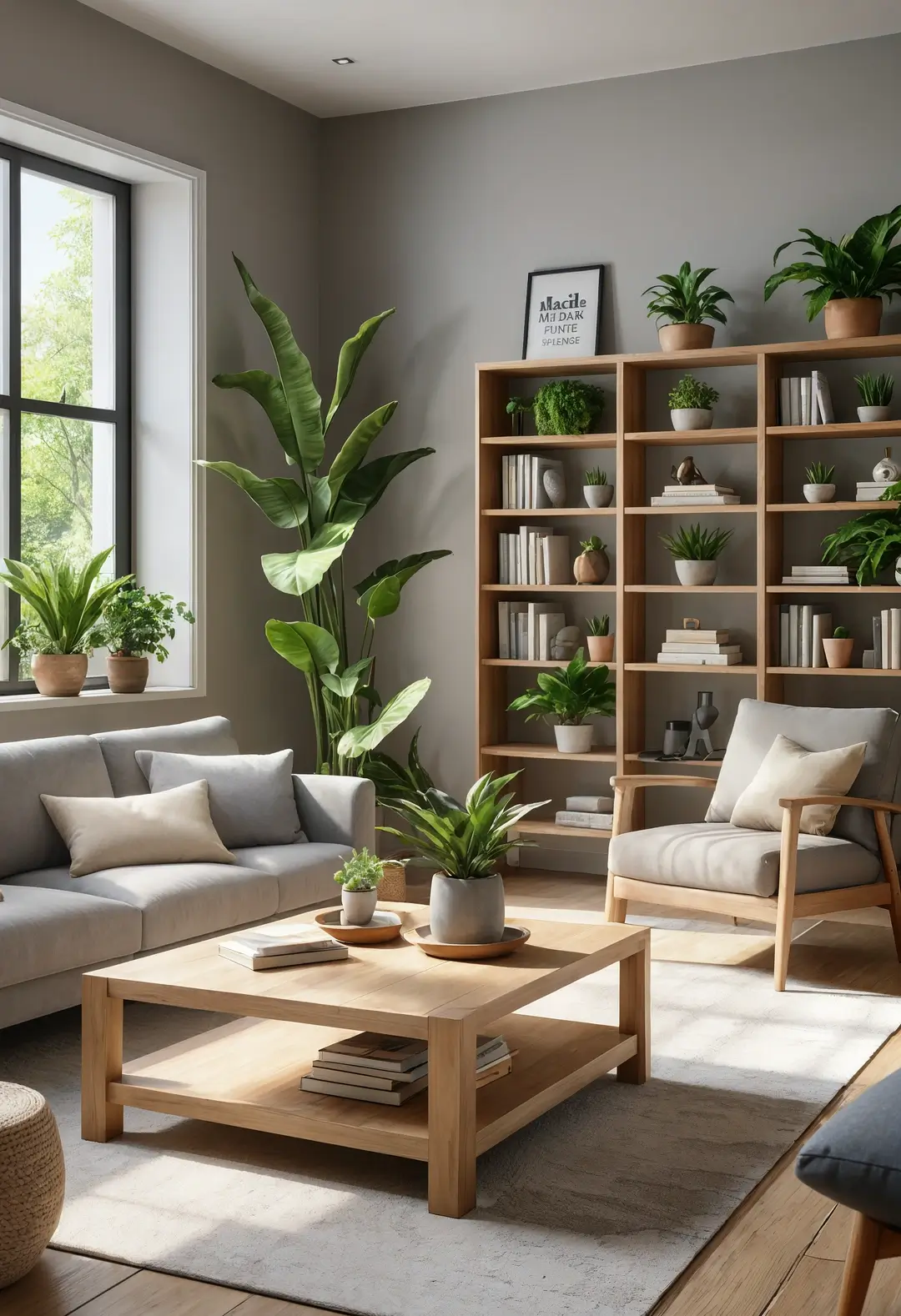
This approach incorporates organic materials to warm neutral color schemes. Wood, stone, and plants can add natural character while maintaining sophisticated color palettes.
Natural elements can prevent neutral rooms from feeling sterile while providing connection to outdoor environments. The combination often works for those wanting sophistication with organic warmth.
Natural material benefits: Organic materials often age gracefully and can add warmth to neutral color schemes without compromising sophistication.
7. Scandinavian-Inspired Neutral Simplicity
This approach uses Nordic design principles with neutral foundations. Light colors and natural materials can create airy, functional environments while maintaining sophisticated appeal.
Functional storage and simple furniture forms can enhance both aesthetics and daily practicality. The combination typically appeals to those wanting organized, efficient living with sophisticated aesthetics.
Scandinavian functionality: Nordic design principles often prioritize function alongside aesthetics, making them practical for daily family living.
8. Layered Neutral Depth Strategy
This approach creates visual depth through multiple neutral tones. Varying shades of beige and grey can create sophisticated gradations while maintaining overall color harmony.
Careful attention to undertones helps ensure color compatibility while preventing flat, monotonous appearances. The combination often works for those wanting subtle complexity within neutral frameworks.
Neutral layering: Successful neutral combinations require attention to undertones to ensure colors work harmoniously rather than competing.
9. Industrial Neutral with Soft Balance
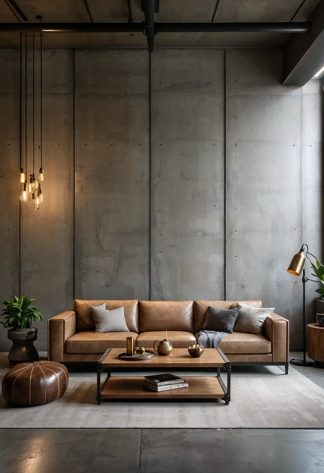
This approach combines raw industrial elements with soft neutral colors. Concrete, metal, and leather can provide contemporary edge while beige textiles add comfort and warmth.
The contrast between hard and soft materials can create visually interesting environments that remain comfortable for daily use. The combination often appeals to those wanting urban sophistication with livable comfort.
Industrial balance: Raw materials in residential settings typically need softening through textiles and lighting to remain comfortable for daily living.
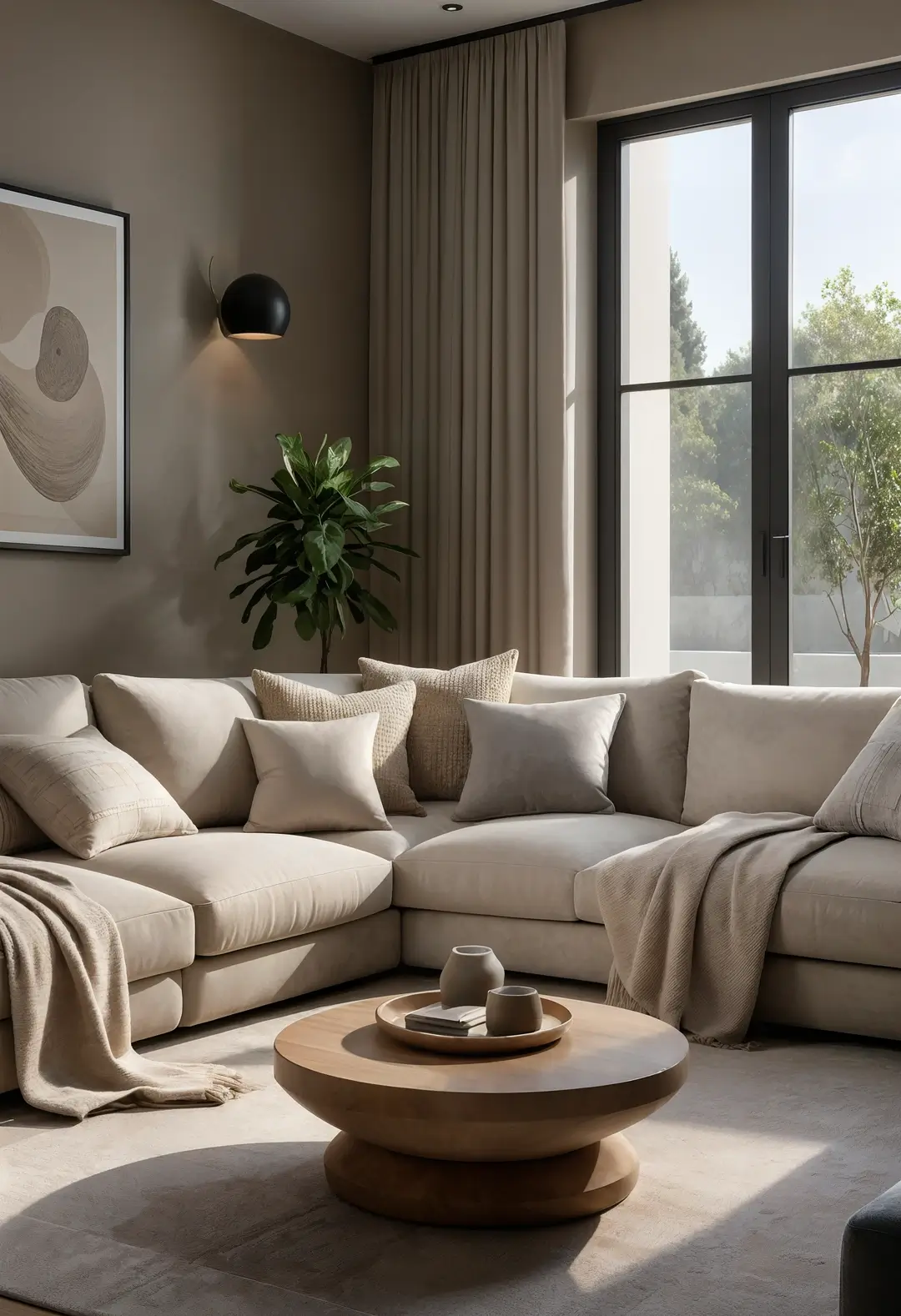
10. Warm Grey with Earth Tone Integration
This approach uses grey tones with brown undertones for natural warmth. Warm greys can provide sophisticated foundations while earth-toned accessories add organic appeal.
Natural materials like wood and leather can enhance the warm feeling while maintaining contemporary sophistication. The combination typically works for those wanting modern aesthetics with comfortable, approachable feelings.
Warm grey selection: Grey tones with brown undertones often feel more welcoming than cool greys in residential settings.
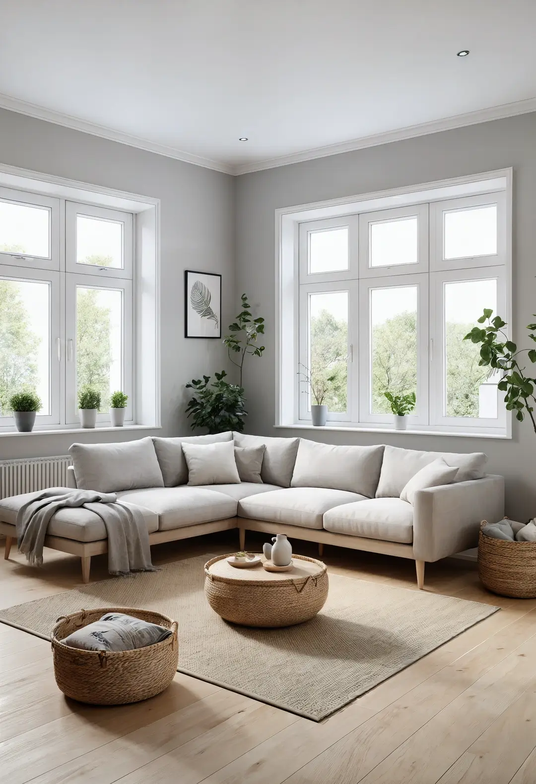
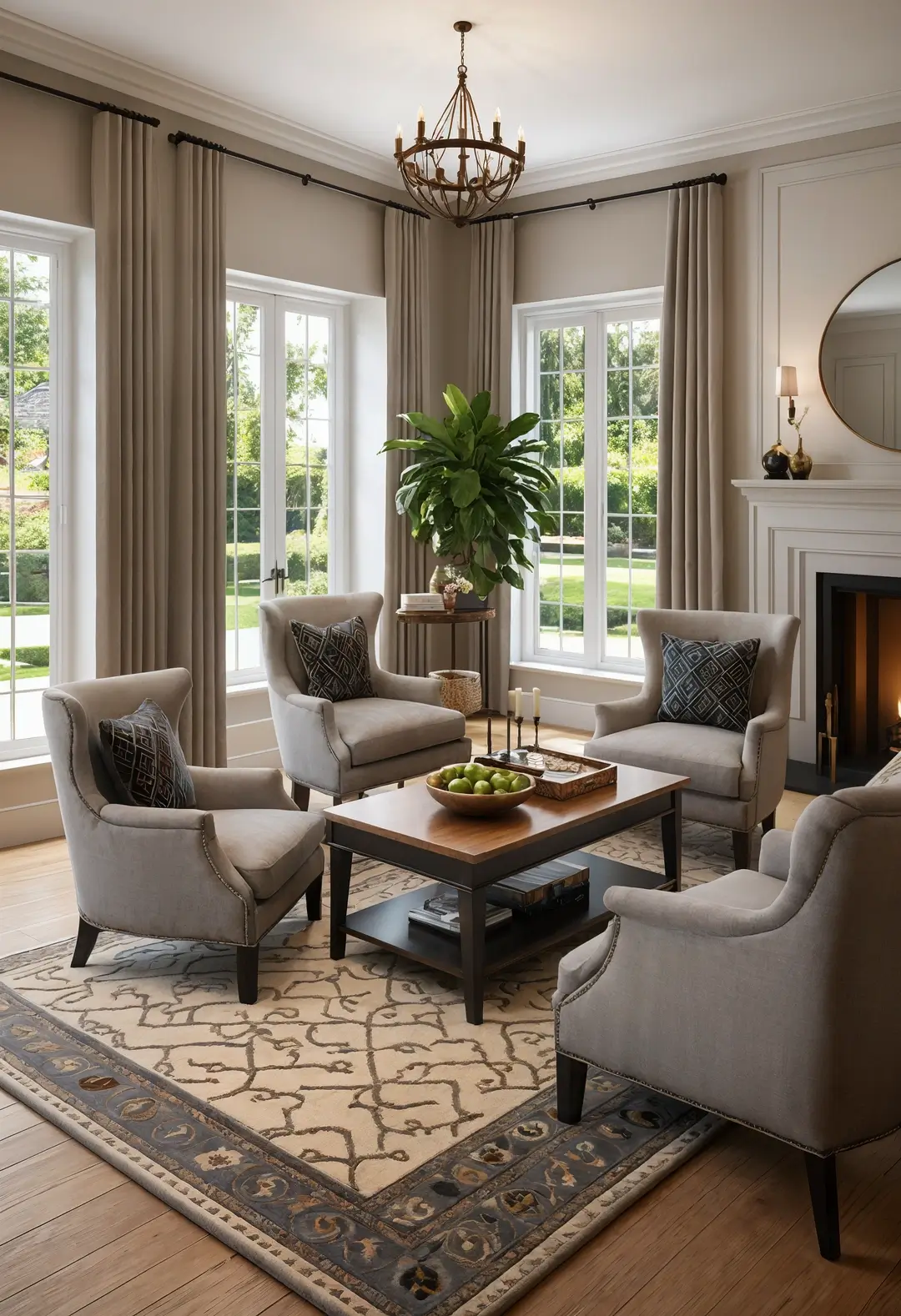
11. Layered Window Treatment Strategy
This approach uses multiple tones for architectural emphasis. Light wall colors with contrasting window treatments can create visual depth and architectural interest.
Layered window treatments can provide both privacy and light control while adding design sophistication. The combination often works in rooms where window placement is a significant design feature.
Window treatment function: Successful window treatments should balance privacy, light control, and aesthetic appeal for optimal functionality.
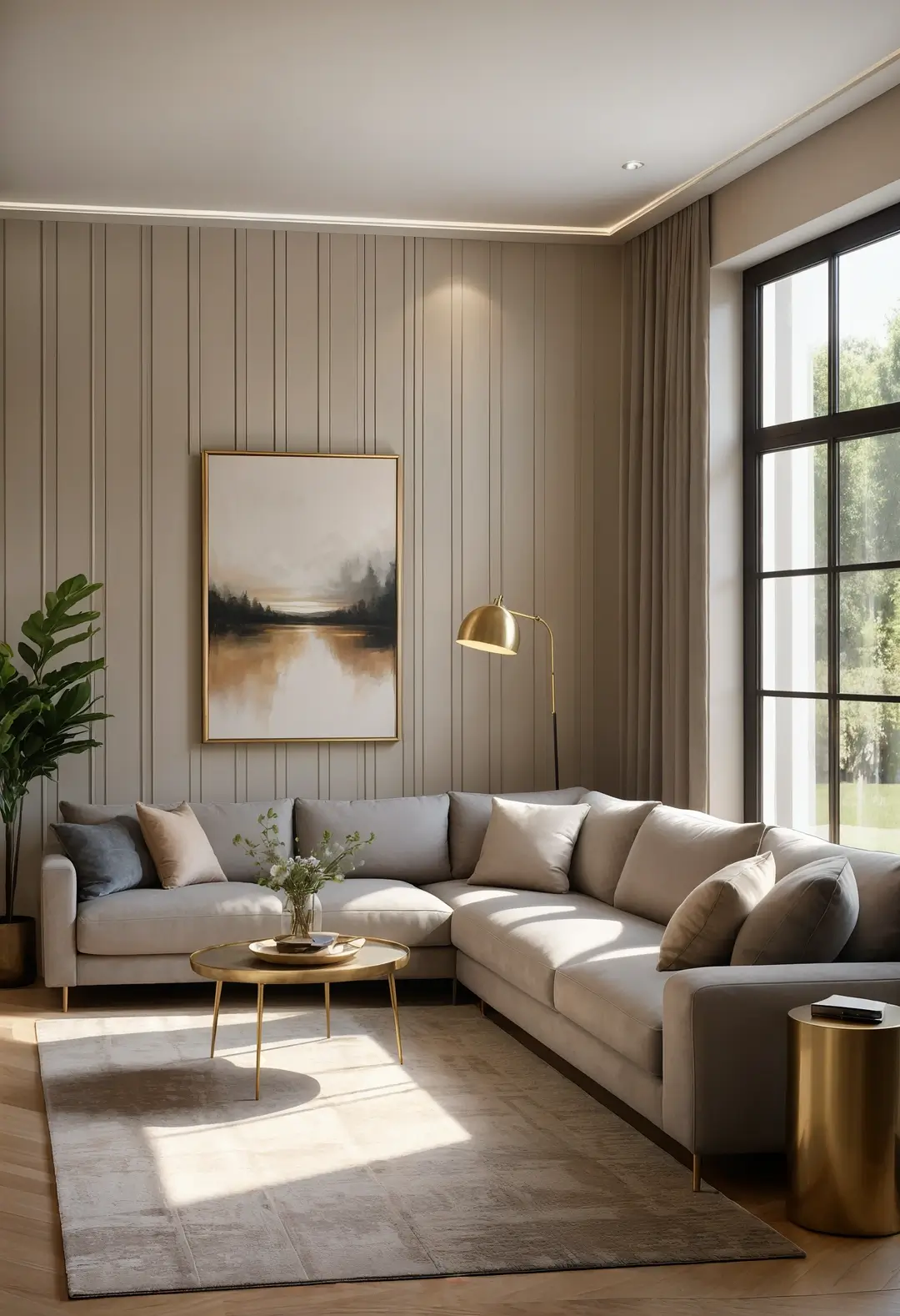
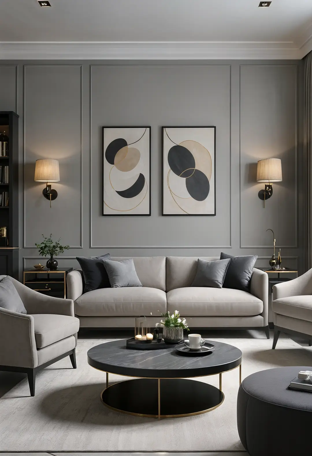
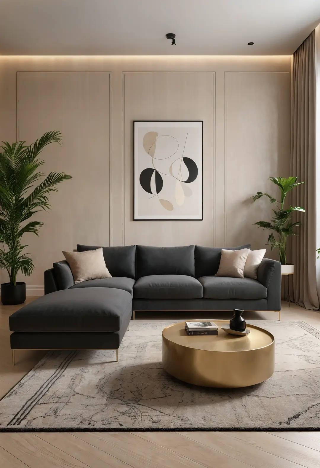
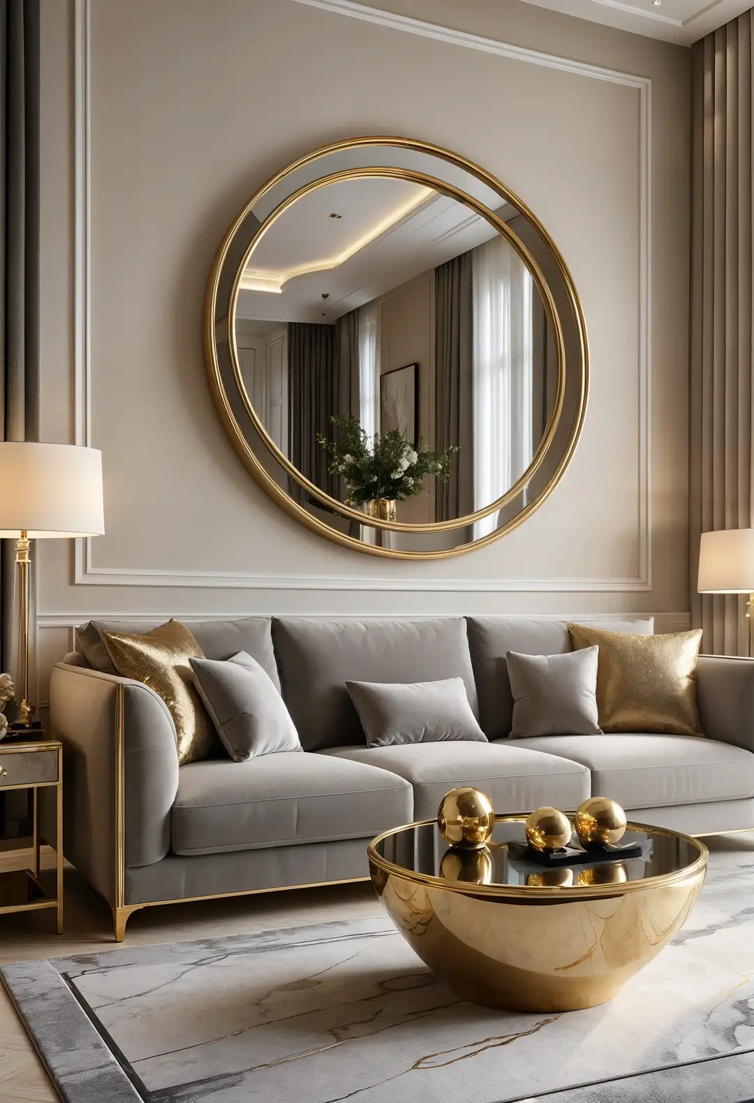
12. Metallic Accent Integration
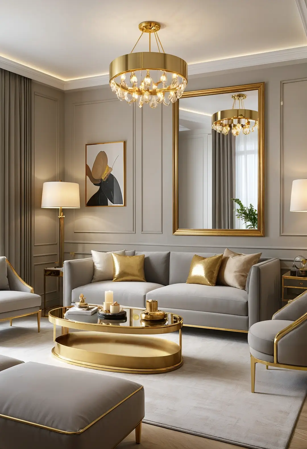
This approach incorporates luxury elements through metallic details. Gold accents can add warmth and elegance while maintaining neutral color foundations.
Quality metallic finishes can provide lasting luxury appeal while coordinating with both warm and cool neutral tones. The combination typically appeals to those wanting sophisticated elegance within neutral frameworks.
Metallic quality: Higher-quality metallic finishes typically provide better longevity and more sophisticated appearance than cheaper alternatives.
13. Eclectic Foundation with Neutral Base
This approach uses neutral foundations to support diverse decorative elements. Beige and grey provide stable backgrounds for varied colors and patterns without visual competition.
The neutral foundation allows for personal expression and seasonal changes while maintaining overall design coherence. The combination often works for those wanting flexible personal style within sophisticated frameworks.
Eclectic balance: Neutral foundations can unify diverse decorative elements while allowing for personal expression and easy updates.
14. Traditional Elegance with Neutral Sophistication
This approach incorporates classic design elements within neutral color schemes. Traditional furniture forms and patterns can work beautifully with sophisticated neutral palettes.
Quality traditional materials like wool and wood can provide lasting appeal while maintaining comfortable, familiar aesthetics. The combination often appeals to those wanting timeless elegance without bold colors.
Traditional materials: Classic materials often age gracefully and provide lasting value within neutral color schemes.
15. Lighting Design with Neutral Enhancement
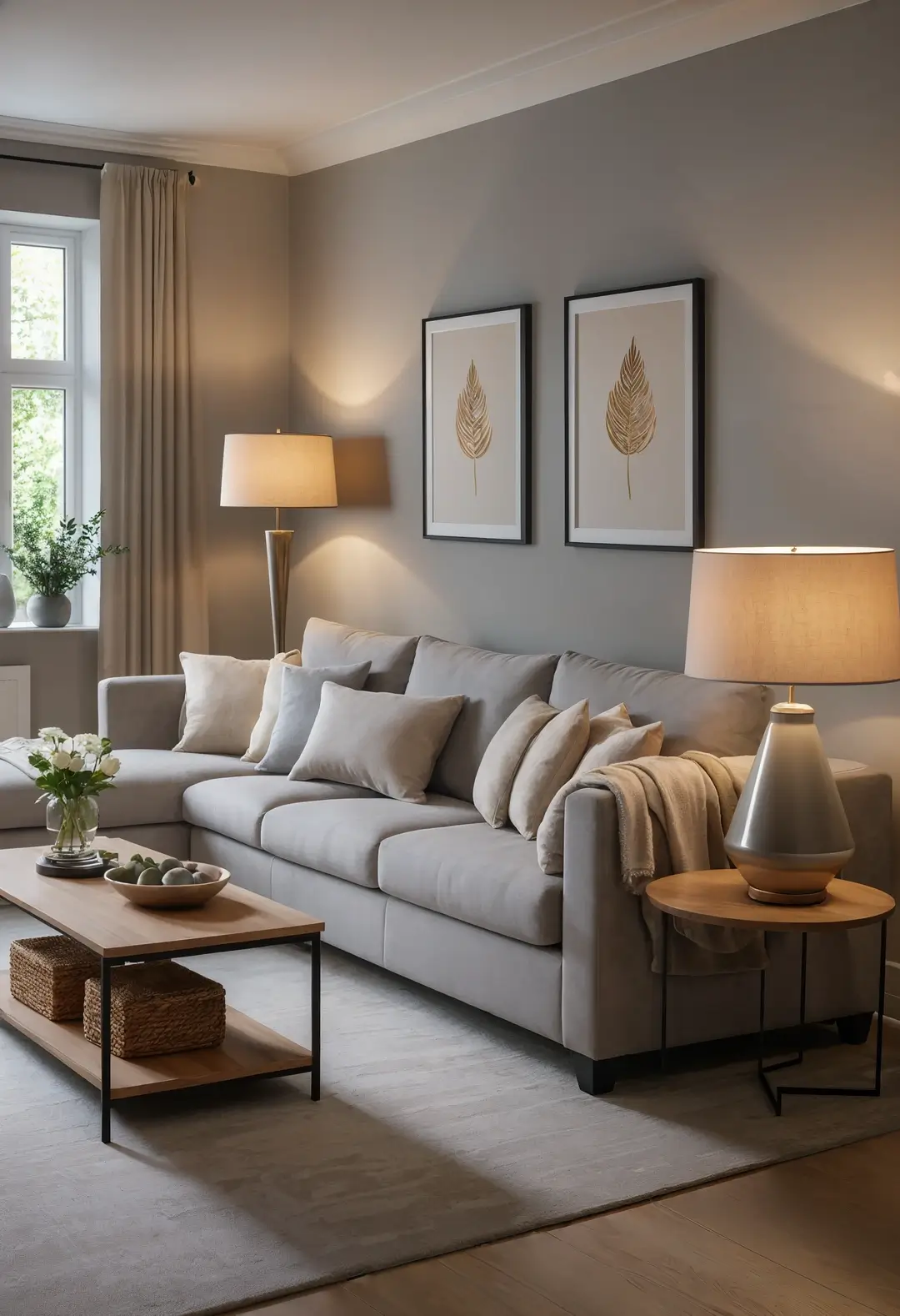
This approach uses lighting to enhance neutral color schemes. Warm lighting can bring out the best in neutral tones while creating comfortable evening environments.
Layered lighting from multiple sources can create depth and ambiance while showcasing neutral colors effectively. The combination typically works for rooms used extensively in the evening.
Lighting temperature: Warm lighting often enhances neutral colors more effectively than cool lighting, particularly in residential settings.
16. Luxury Material Integration
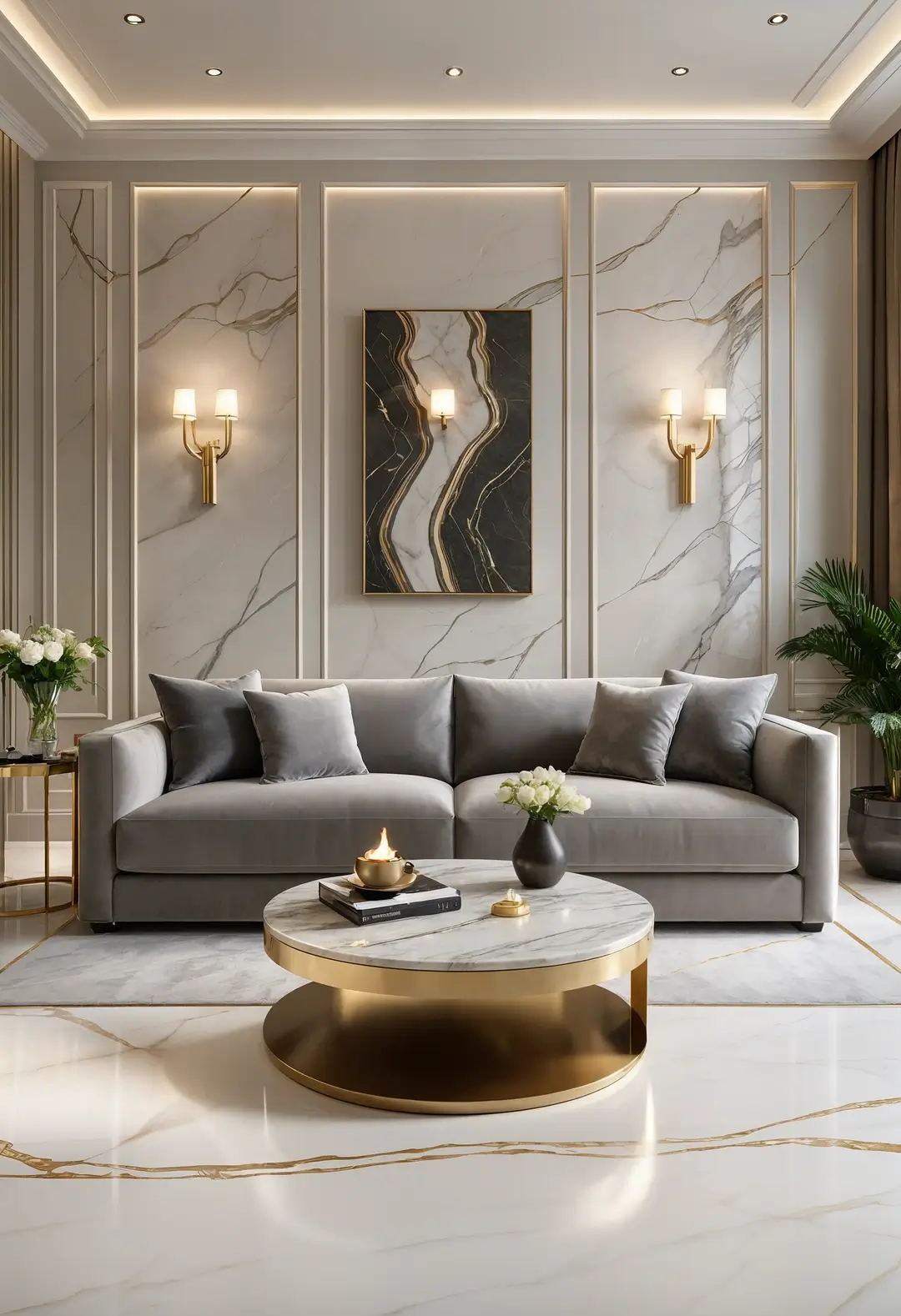
This approach incorporates upscale materials for sophisticated elegance. Marble and other natural stones can provide luxury appeal while coordinating with neutral color palettes.
Quality luxury materials often provide lasting value and sophisticated appearance while remaining practical for daily use. The combination appeals to those wanting upscale aesthetics with neutral sophistication.
Luxury material maintenance: High-end natural materials typically require specific care routines but provide lasting beauty when properly maintained.
17. Reflective Surface Strategy
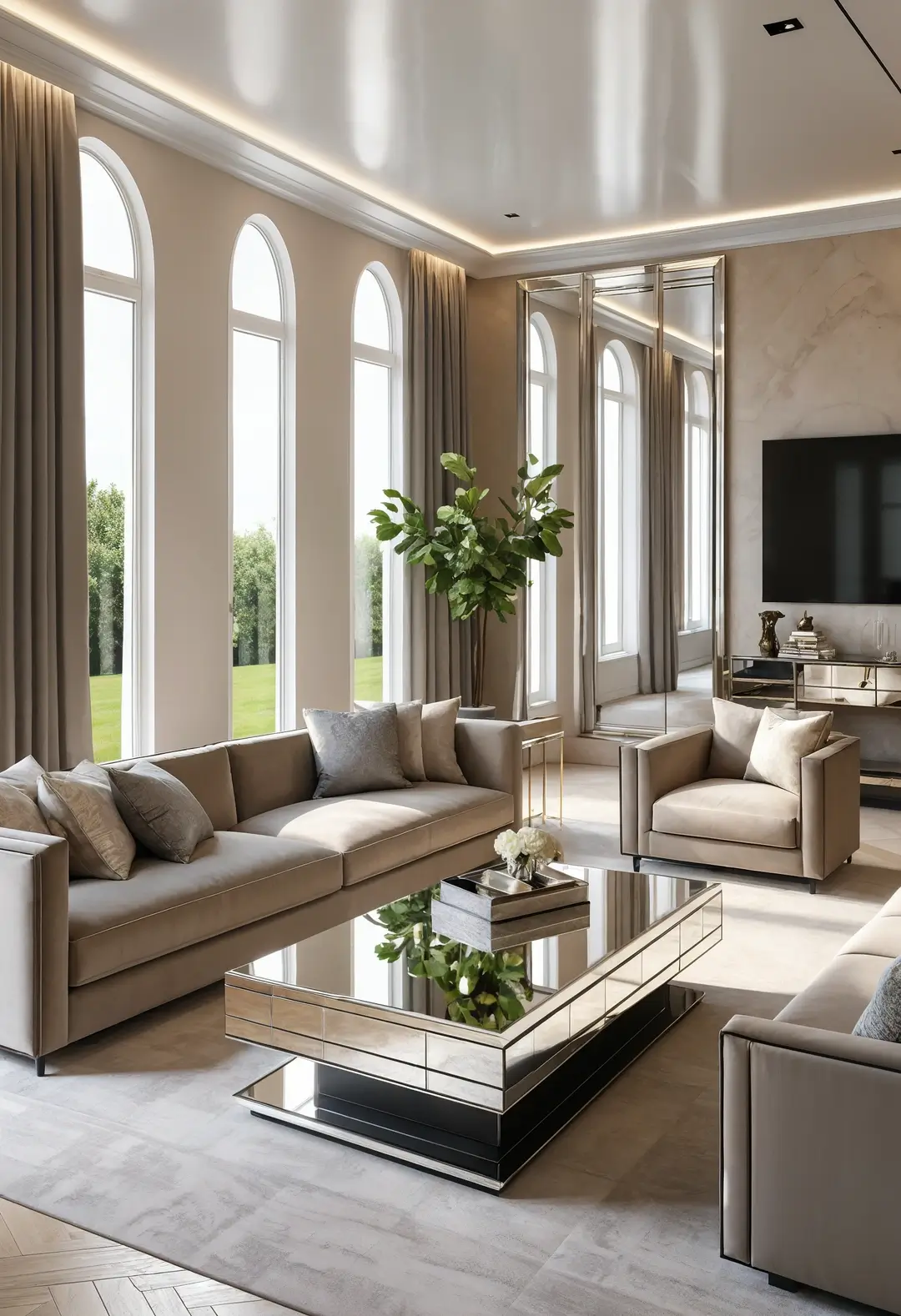
This approach uses mirrors and glass to enhance neutral spaces. Reflective surfaces can multiply light and create visual spaciousness while coordinating with neutral color schemes.
Glass and mirrored elements can add contemporary sophistication while maintaining the serene quality of neutral palettes. The combination often works in smaller spaces or areas with limited natural light.
Reflective benefits: Mirrors and glass can significantly enhance both light levels and spatial perception in neutral color schemes.
18. Soft Pastel Accent Integration
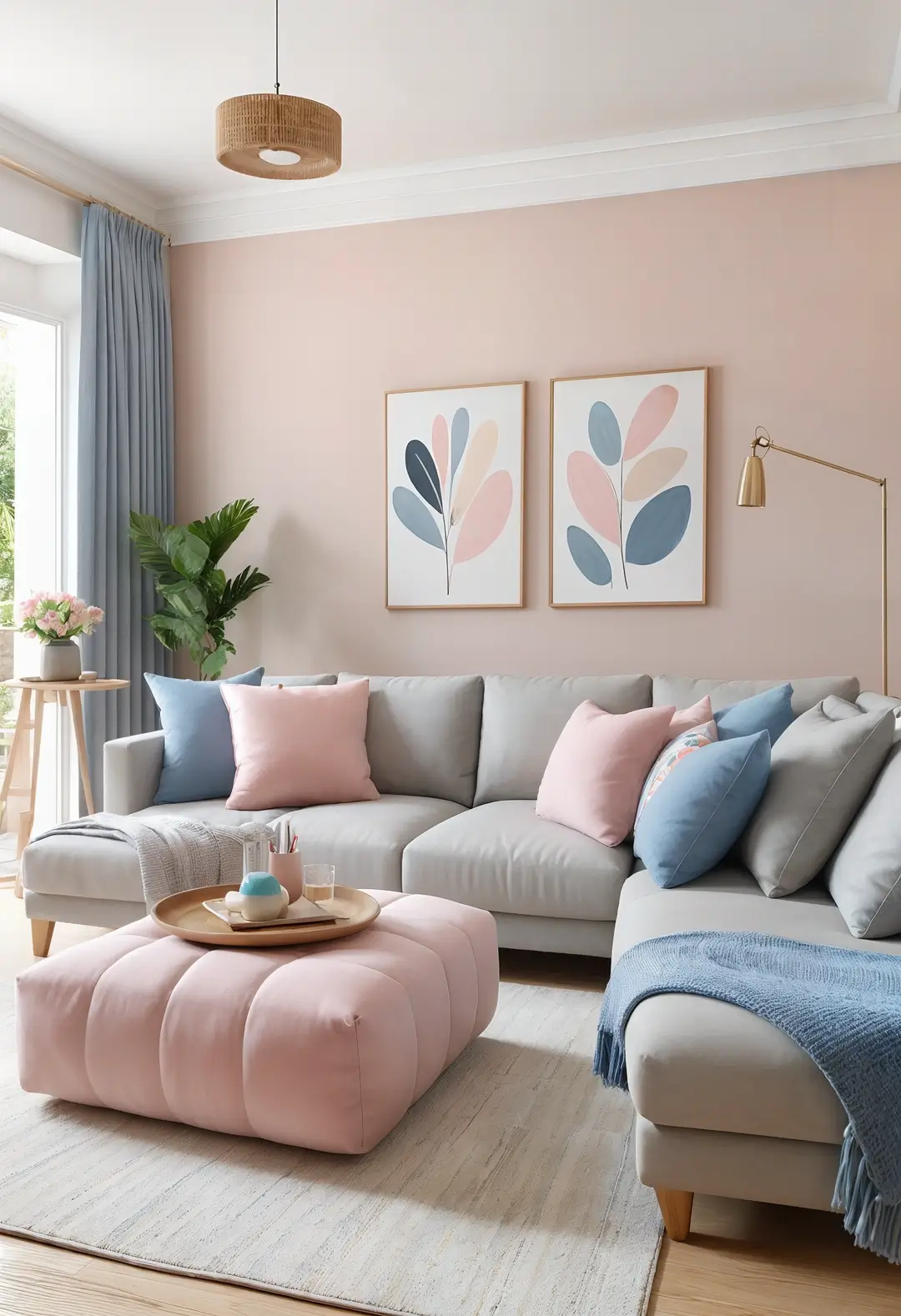
This approach adds gentle color through subtle pastel touches. Soft pastels can provide color interest without overwhelming neutral foundations or compromising sophisticated appeal.
Pastel accents can be easily changed seasonally while maintaining the neutral foundation investment. The combination often appeals to those wanting subtle color within predominantly neutral schemes.
Pastel integration: Soft pastels often work more successfully than bold colors in predominantly neutral rooms by providing gentle contrast.
19. Comfort-Focused Textile Strategy
This approach prioritizes comfort through luxury textiles. High-quality fabrics can provide both comfort and visual richness while maintaining neutral color palettes.
Varied textile textures can create visual interest and tactile appeal while encouraging relaxation and comfort. The combination typically works for those prioritizing comfort alongside sophisticated aesthetics.
Textile quality: Higher-quality fabrics often provide better comfort, durability, and visual appeal in heavily used living spaces.
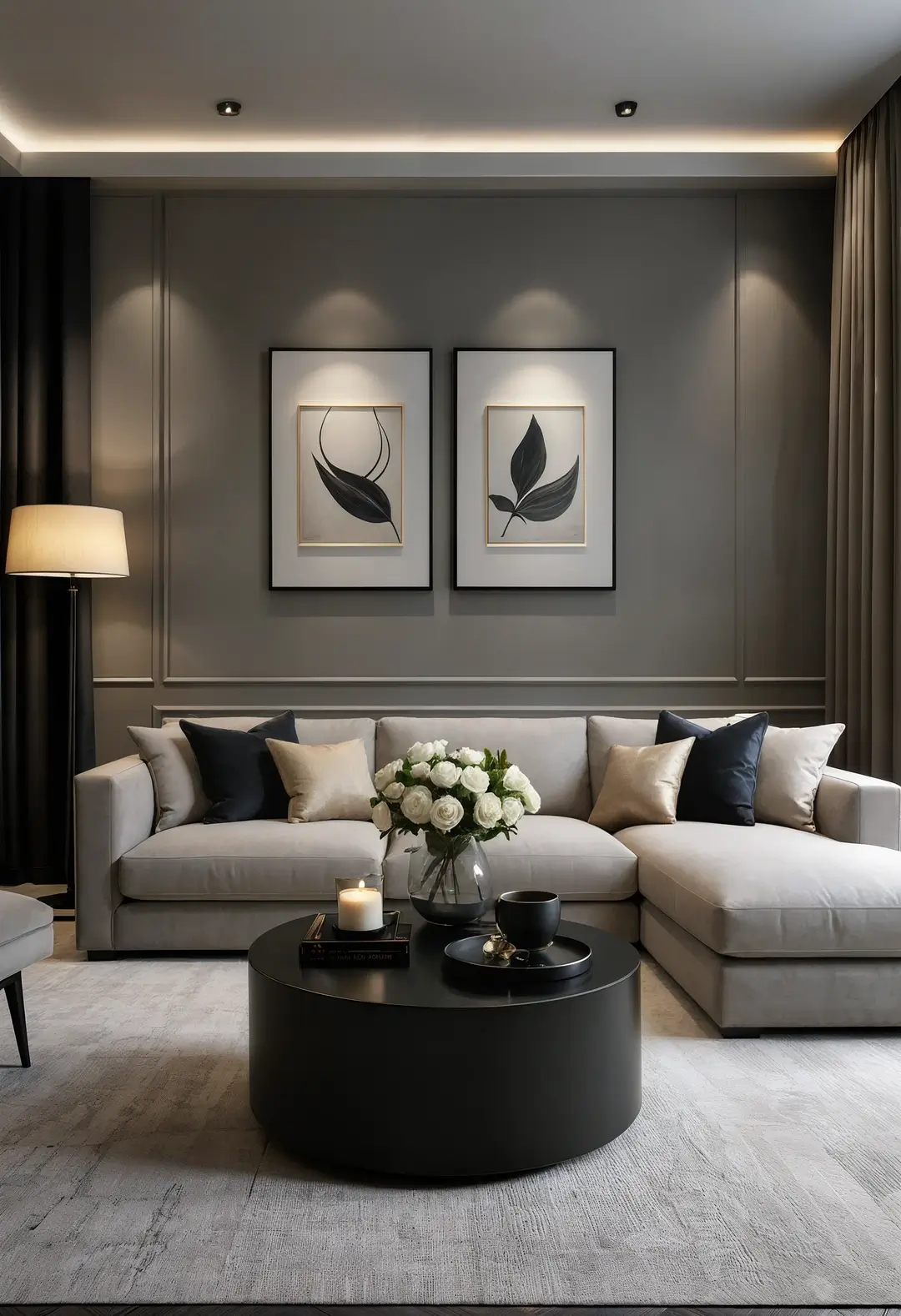
20. Contemporary Contrast with Dark Accents
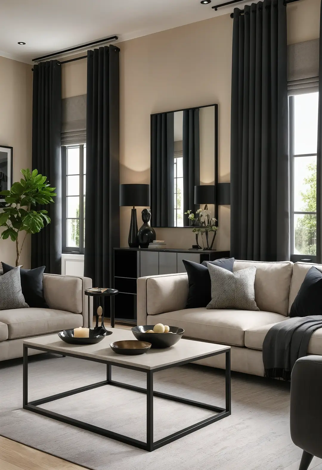
This approach uses dramatic dark accents for contemporary edge. Black or charcoal elements can provide striking contrast while maintaining sophisticated neutral foundations.
Dark accents can add contemporary drama while remaining within neutral color families. The combination often appeals to those wanting bold contemporary appeal without abandoning neutral sophistication.
Dark accent strategy: Strategic dark accents can provide contemporary sophistication while maintaining predominantly neutral color schemes.
21. Modern Material Integration
This approach combines contemporary materials for sleek sophistication. Leather and metal can provide modern appeal while coordinating with neutral color palettes.
Quality modern materials can provide lasting value and easy maintenance while maintaining sophisticated contemporary aesthetics. The combination typically works for those wanting modern appeal with practical functionality.
Modern material benefits: Contemporary materials often provide easier maintenance and contemporary appeal within neutral design frameworks.
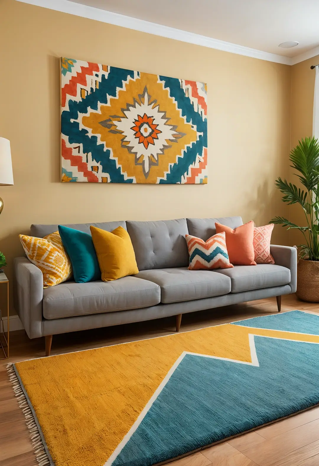
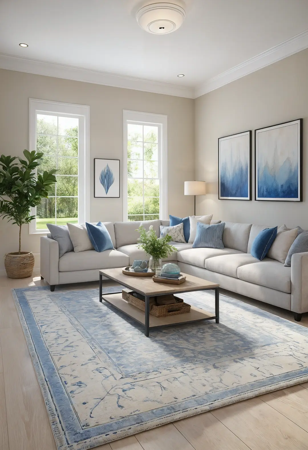
22. Subtle Color Integration
This approach incorporates gentle color through strategic placement. Blue or other soft colors can provide subtle interest without overwhelming neutral foundations.
Soft colors can be introduced through easily changeable elements like pillows or artwork while maintaining neutral furniture investments. The combination works for those wanting flexibility within neutral schemes.
Color introduction strategy: Subtle colors often work more successfully than bold ones in predominantly neutral rooms.
23. Natural Wood Integration
This approach incorporates wood for warmth and natural character. Wooden elements can provide organic appeal while maintaining sophisticated neutral color coordination.
Different wood tones can add visual interest while remaining within natural color palettes. The combination often appeals to those wanting natural warmth within contemporary neutral schemes.
Wood coordination: Successful wood integration often requires coordinating different wood tones rather than exact matching for natural, sophisticated appeal.
24. Open Concept Neutral Flow
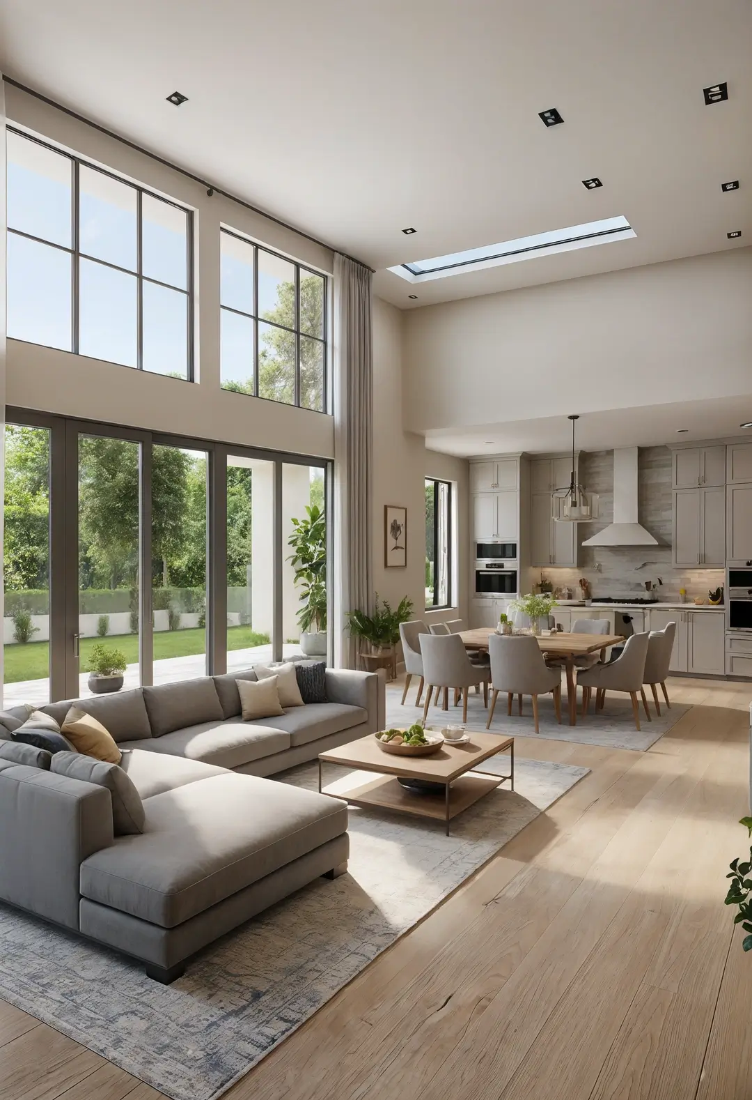
This approach uses neutral colors to create flow between connected spaces. Consistent neutral palettes can unify open floor plans while allowing for subtle area definition.
Neutral colors can provide continuity while allowing for varied furniture and function between connected areas. The combination typically works well in modern open floor plan homes.
Flow strategy: Neutral colors can provide visual continuity in open spaces while allowing functional variation between areas.
25. Vintage Element Integration
This approach incorporates period pieces within neutral contemporary schemes. Vintage furniture and accessories can add character while neutral backgrounds provide sophisticated coordination.
Quality vintage pieces often provide unique character and lasting value while working within neutral color schemes. The combination appeals to those wanting personal history within contemporary sophistication.
Vintage integration: Neutral backgrounds often showcase vintage pieces more effectively than bold colors while maintaining contemporary sophistication.
26. Bold Neutral Contrast Strategy
This approach uses dramatic neutral contrasts for contemporary impact. Dark charcoal against light beige can create striking visual interest while remaining within neutral color families.
High contrast neutral combinations can provide contemporary drama while maintaining sophisticated color restraint. The combination often works for those wanting bold contemporary appeal within neutral frameworks.
Neutral contrast: High contrast neutral combinations can provide visual drama while maintaining color sophistication and flexibility.
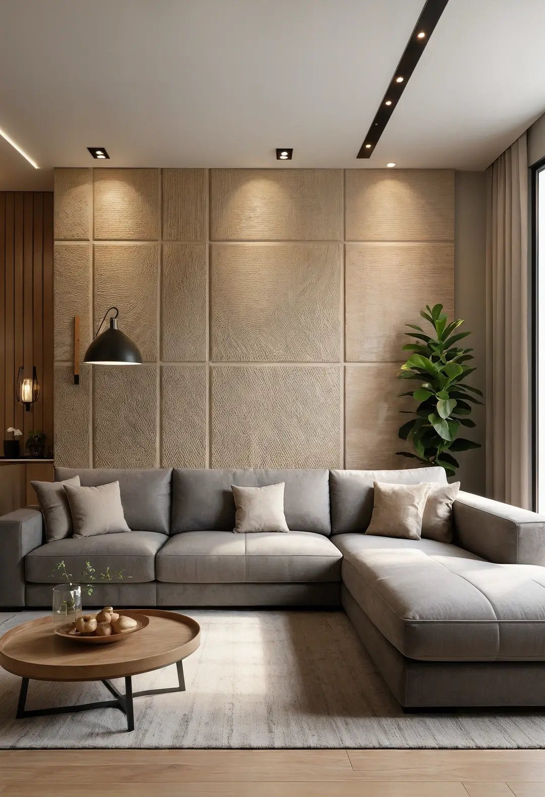
27. Textural Wall Treatment
This approach creates interest through wall texture rather than color. Textured wall treatments can provide visual appeal while maintaining neutral color sophistication.
Wall textures can add architectural interest without requiring bold colors or patterns. The combination typically appeals to those wanting visual interest within minimalist color schemes.
Textural benefits: Wall textures can provide visual interest and tactile appeal while maintaining neutral color sophistication.
28. Pattern Integration Strategy
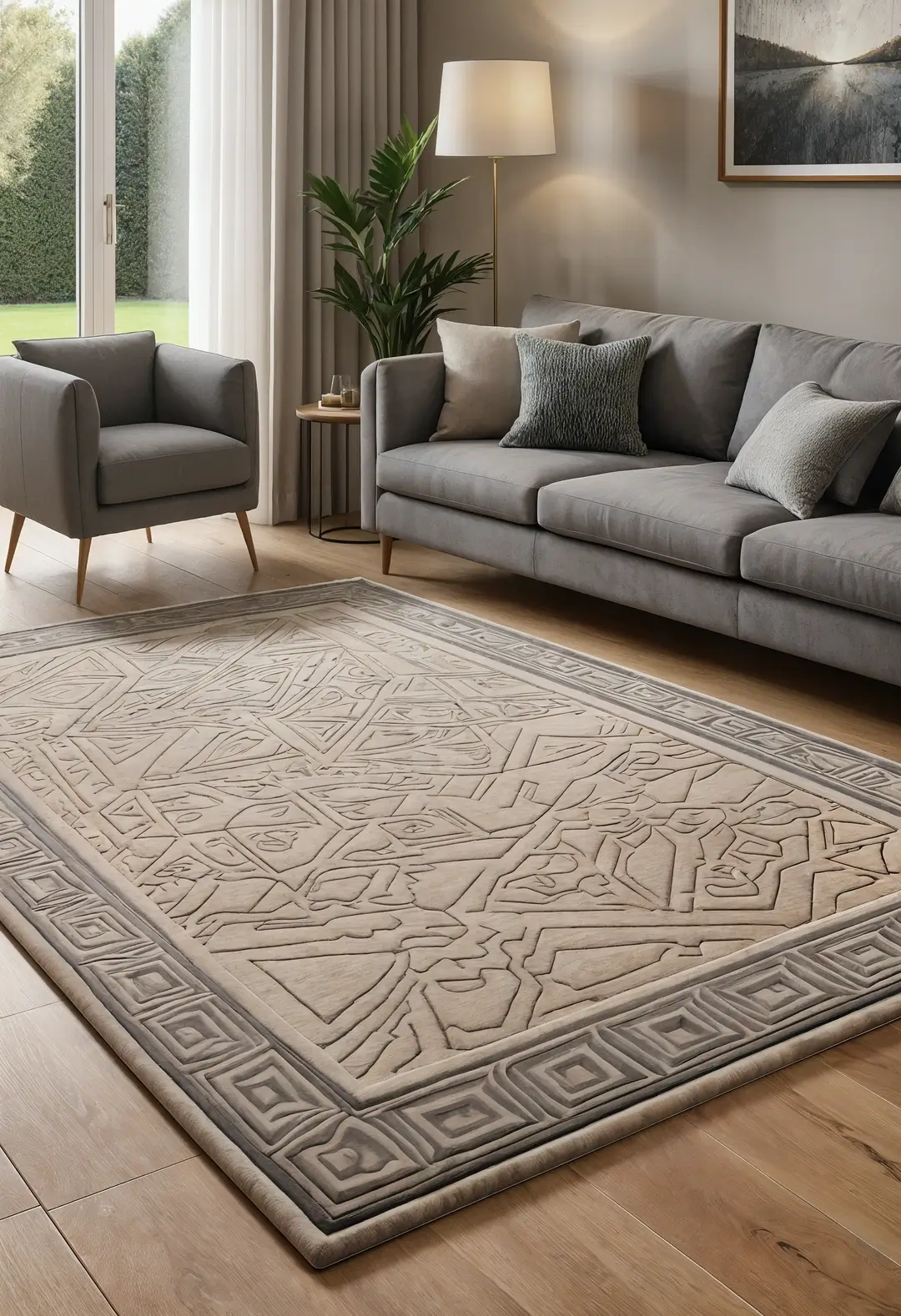
This approach incorporates patterns within neutral color schemes. Geometric or organic patterns in neutral tones can provide visual interest without overwhelming sophisticated color palettes.
Patterned rugs or textiles can add complexity while remaining within neutral color families. The combination often works for those wanting visual interest within sophisticated neutral schemes.
Pattern coordination: Successful patterns in neutral rooms often share color palettes while varying scales for visual harmony.
29. Metallic Detail Enhancement
This approach uses various metals for luxury appeal and visual interest. Different metallic finishes can provide sophisticated variety while coordinating with neutral color foundations.
Quality metallic details can add luxury appeal and reflect light effectively while remaining within neutral design principles. The combination typically appeals to those wanting sophisticated glamour within neutral frameworks.
Metallic variety: Mixed metallic finishes often create more sophisticated results than single metal approaches when coordinated thoughtfully.
Creating Your Perfect Beige and Grey Living Room
Based on various homeowner experiences, successful beige and grey living room design often happens when you choose approaches that genuinely enhance your daily living patterns while providing the visual calm that draws people to neutral palettes.
Consider your actual living room use—do you need spaces for active family activities, formal entertaining, or quiet relaxation?
The most functional neutral living rooms typically balance aesthetic sophistication with practical considerations like maintenance requirements, lighting needs, and furniture durability.
Start by honestly assessing your lifestyle demands, lighting conditions, and personal style preferences, then consider which neutral approaches might enhance rather than compromise your daily enjoyment of the space.
Remember that neutral color schemes can serve as long-term foundations that adapt to changing preferences and life stages, so choosing quality materials and timeless proportions often provides better satisfaction than focusing solely on current design trends.
Final reminder: Living room renovations may involve electrical work for lighting, structural modifications for built-ins, or other changes requiring professional consultation. Always ensure proper planning and code compliance for lasting safety and functionality.