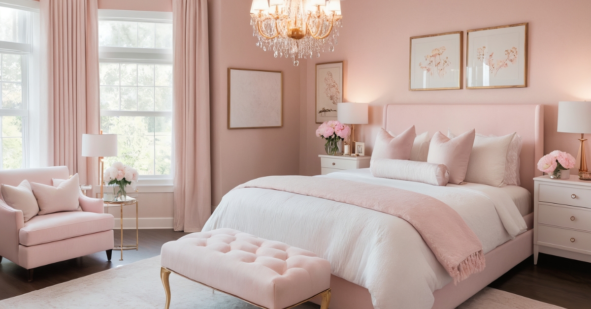
After designing over 200 bedrooms in my nine years as an interior consultant, I’ve witnessed pink evolve from a color associated primarily with children’s rooms to one of the most versatile and sophisticated choices for adult bedrooms. The key lies in understanding how different shades of pink interact with lighting, textures, and complementary colors to create spaces that feel both calming and energizing, depending on the desired outcome.
What initially surprised me about pink bedrooms was how dramatically different the same color could feel based on its surrounding elements and application techniques. Through extensive projects ranging from minimalist urban apartments to luxurious suburban master suites, I’ve learned that successful pink bedroom design requires understanding both color theory and the psychological effects of different pink tones on sleep and relaxation.
The growing acceptance of pink in sophisticated interior design reflects our evolving understanding of color psychology and gender-neutral design principles. Let me share 49 proven approaches that have consistently created stunning pink bedrooms, along with the practical insights I’ve gained from implementing each in real homes.
Luxury and Metallic Combinations
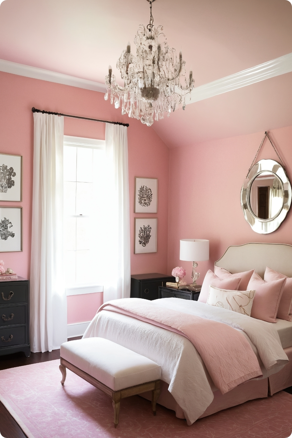
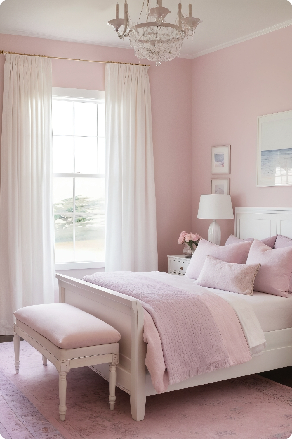
1. Blush and Gold: A Regal Combination
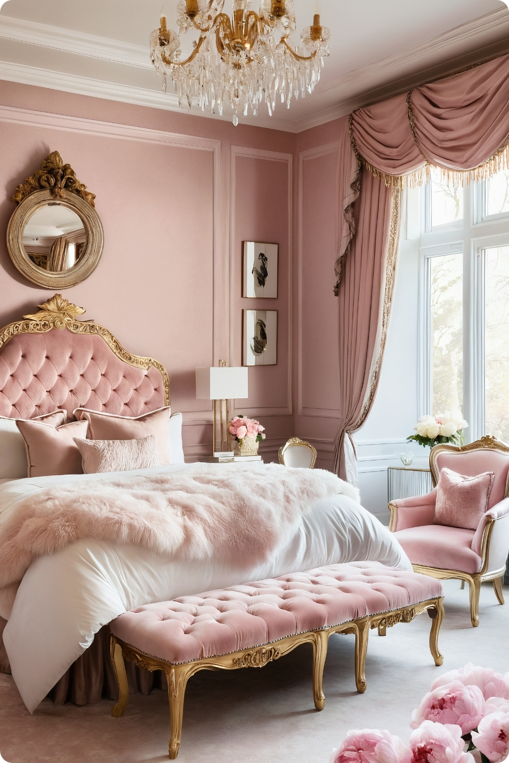
Creating truly luxurious blush and gold combinations requires understanding undertones and quality differences in metallic finishes. I’ve learned that warm gold tones work better with pink than cool yellows, which can create jarring contrasts. The key is using gold sparingly as accent elements rather than overwhelming the space.
When selecting blush paint colors, I test them at different times of day since pink can shift dramatically with changing light. Benjamin Moore’s “Pink Bliss” works well in rooms with abundant natural light, while Farrow & Ball’s “Setting Plaster” performs better in spaces with limited windows.
Crystal chandeliers with gold accents require proper ceiling support and electrical capacity planning. Many clients underestimate the weight and electrical requirements of substantial lighting fixtures. I always work with electricians to ensure adequate ceiling reinforcement and appropriate circuit capacity.
The balance between blush walls and gold accents needs careful calibration—too much gold appears gaudy, while too little fails to create the desired luxury impact. I typically limit gold elements to 15-20% of visible surfaces for optimal visual balance.
2. Ombre Pink Walls
Ombre wall techniques require skilled painters and proper preparation to achieve smooth transitions between colors. The blending process needs to happen while paint remains workable, which limits the wall area that can be completed in single sessions.
I’ve found that three-color ombres work better than attempts to blend more shades, which often result in muddy transitions. Starting with Sherwin-Williams’ “Intimate White” at the bottom and progressing through “Heartfelt” to “Loveable” creates believable color progression that mimics natural light effects.
The furniture selection becomes crucial in ombre rooms since competing patterns or colors can create visual chaos. Neutral bedding in whites and light grays allows the wall treatment to serve as the room’s primary focal point while maintaining restful qualities essential for bedroom spaces.
Textured elements like shaggy rugs and chunky knit throws add essential tactile interest without competing visually with the wall treatment. The key is choosing textures that complement rather than distract from the color gradient.
Contemporary Color Combinations
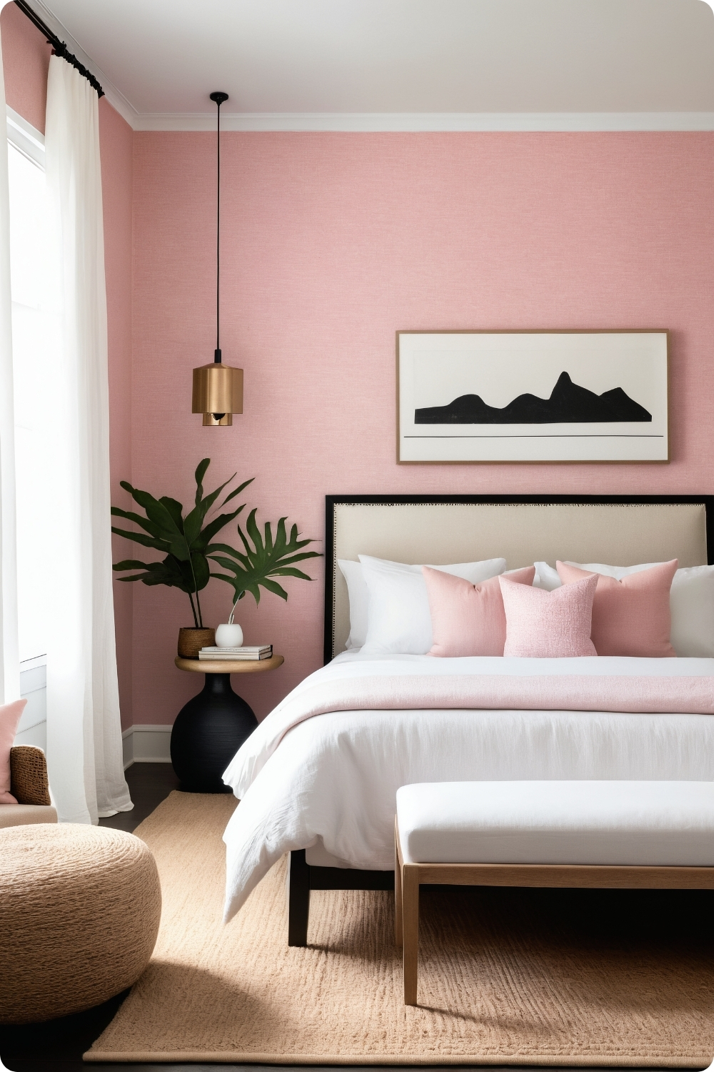
3. Pink and Gray: A Modern Twist
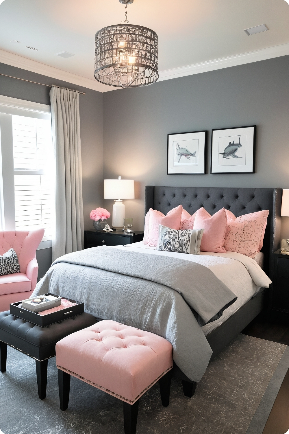
The pink and gray combination works because these colors share similar intensity levels when properly selected. I typically choose medium-toned grays like Behr’s “Dolphin Fin” that provide enough contrast without overwhelming the pink elements.
Texture mixing becomes essential in monochromatic-leaning schemes to prevent flatness. Combining velvet, linen, and faux fur textures in pink accent pieces creates visual depth while maintaining color story continuity throughout the space.
Metallic hardware selection affects the overall temperature of the color scheme. Brushed nickel and chrome provide cool balance against warm pink tones, while brass or gold can make the space feel too warm and overwhelming.
The proportion of pink to gray requires careful consideration based on room size and natural light. Smaller rooms benefit from more gray with pink accents, while larger spaces can handle more pink without feeling overwhelming.
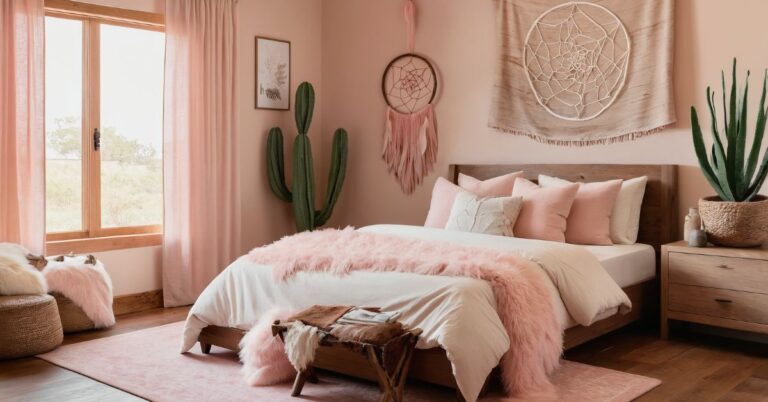
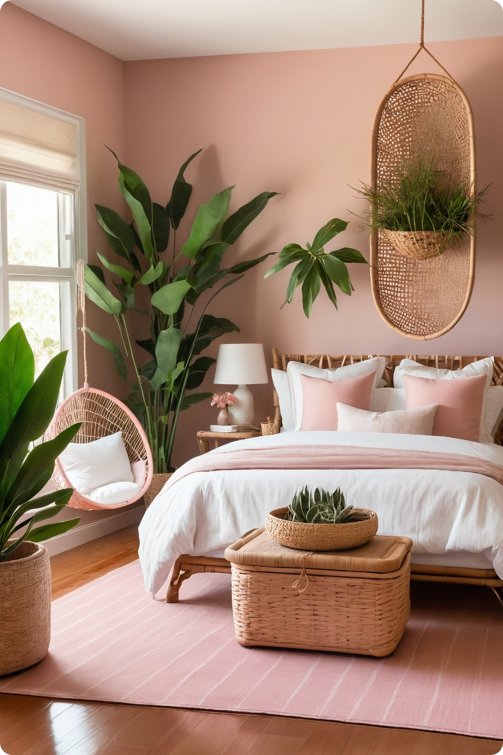
4. Bohemian Pink Paradise
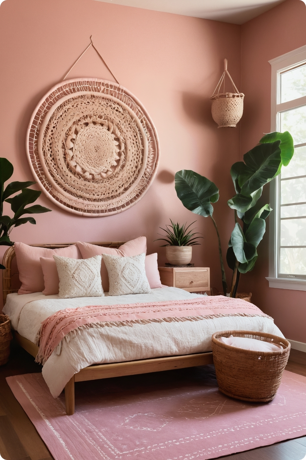
Authentic bohemian design requires understanding cultural influences and avoiding superficial styling that appropriates without respect. I source textiles and accessories from artisan producers who maintain traditional techniques rather than mass-market suppliers.
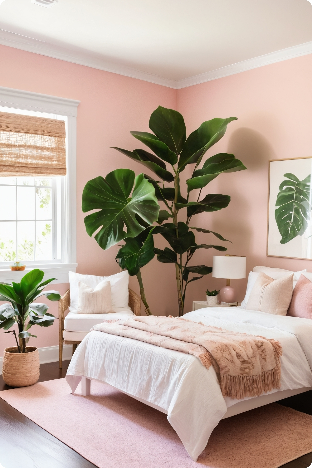
Plant selection for bohemian bedrooms needs to consider care requirements and how they’ll realistically fit into clients’ lifestyles. Peace lilies and pothos work well for lower-light bedrooms, while ficus requires more consistent care and bright light conditions.
Warm, earthy pinks like Sherwin-Williams’ “Malted Milk” provide better foundations for bohemian aesthetics than cool-toned pinks that can clash with natural materials and global textiles commonly used in boho designs.
Macramé wall hangings require proper mounting to support their weight, especially large pieces. I always use appropriate wall anchors and ensure mounting points can handle dynamic loads from fabric movement.
5. Minimalist Pink and White
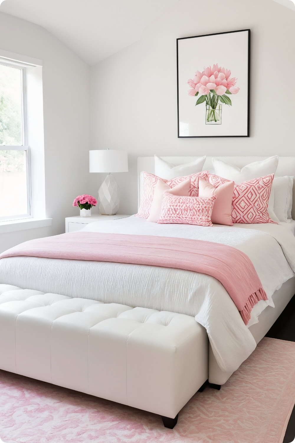
Minimalist pink bedrooms require exceptional attention to proportion and negative space management. The absence of visual clutter means every element must be perfectly scaled and positioned to maintain the clean aesthetic.
Platform bed selection becomes crucial since the bed often serves as the room’s primary furniture piece. Clean lines and proper proportional relationships with ceiling height and room dimensions affect how successfully the minimalist approach works.
Geometric pink elements need to reference established design principles rather than arbitrary shapes. I typically choose accessories and art that follow golden ratio proportions or established geometric relationships.
The quality of white paint becomes critical in minimalist schemes since imperfections and undertones become more visible without other elements to distract attention. Benjamin Moore’s “Simply White” provides consistent results across different lighting conditions.
Pattern and Texture Applications
6. Pink Floral Wallpaper
Large-scale floral wallpaper requires understanding pattern repeat and room proportions to avoid overwhelming smaller spaces. I typically recommend limiting bold patterns to single accent walls while using coordinating solid colors on remaining surfaces.
The installation quality becomes crucial with bold patterns since imperfections in alignment or seaming become immediately obvious. I work with experienced wallpaper installers who understand pattern matching and can achieve professional results.
Furniture selection against bold floral backgrounds requires restraint and careful color coordination. Solid-colored bedding that picks up undertones from the wallpaper creates coherence without competing for visual attention.
Lighting affects how floral patterns appear throughout the day, so I always view wallpaper samples under different lighting conditions before making final selections. Colors that appear harmonious in showrooms might clash under home lighting conditions.
7. Dusty Rose and Emerald Green
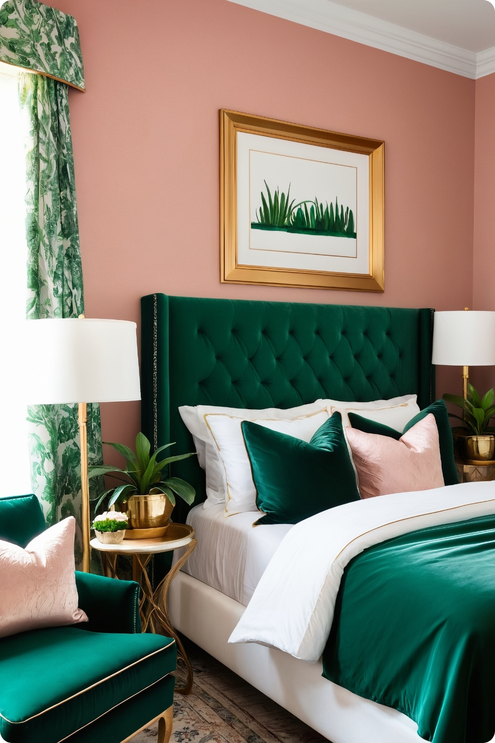
This sophisticated color combination works because dusty rose and emerald green are complementary on the color wheel, creating natural visual tension and balance. The key is using proper proportions—typically 70% dusty rose with 30% emerald green accents.
Emerald green upholstered pieces require understanding fabric durability and maintenance requirements. Velvet shows wear patterns and requires professional cleaning, while performance fabrics offer similar appearance with easier care.
Gold accents bridge the two primary colors by complementing both rose and green undertones. I typically introduce gold through lighting fixtures and picture frames rather than large furniture pieces to maintain color balance.
Botanical prints in gold frames reinforce the natural color relationship while adding organic forms that soften geometric furniture lines. The plant imagery connects the green and rose tones through natural associations.
Bold and Energetic Approaches
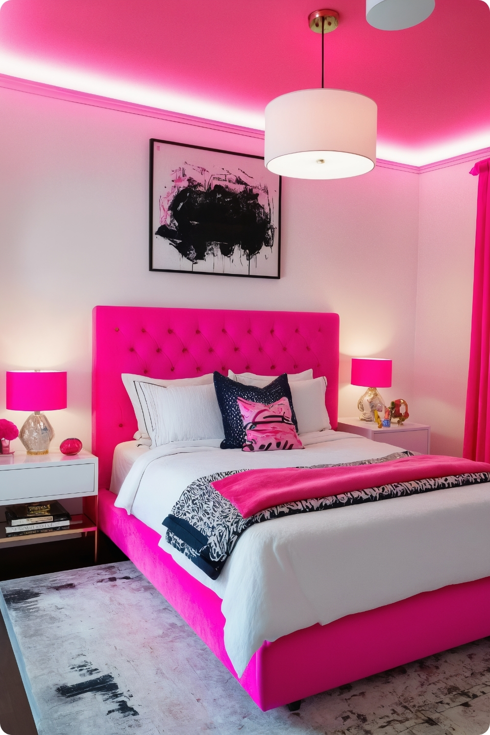
8. Neon Pink Accents
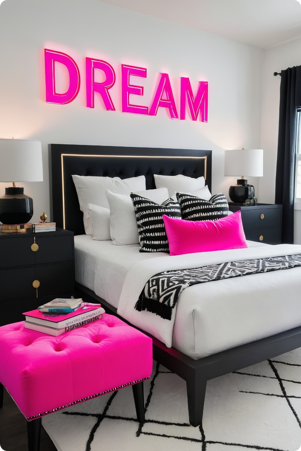
Neon pink requires careful application to avoid overwhelming bedroom spaces intended for rest and relaxation. I typically limit neon elements to small accent pieces that can be easily changed if clients tire of the intense color.
Custom neon signs require professional electrical installation and consideration of heat generation and electrical consumption. These installations often require dedicated circuits and proper ventilation for safe operation.
The psychological effects of neon colors in bedrooms need consideration since bright, stimulating colors can interfere with sleep patterns. I recommend placing neon elements where they won’t be visible from bed during sleep hours.
Balancing neon pink with neutral backgrounds requires understanding color temperature relationships. Cool grays work better than warm whites, which can create jarring contrasts with fluorescent pink tones.
9. Pastel Pink and Mint
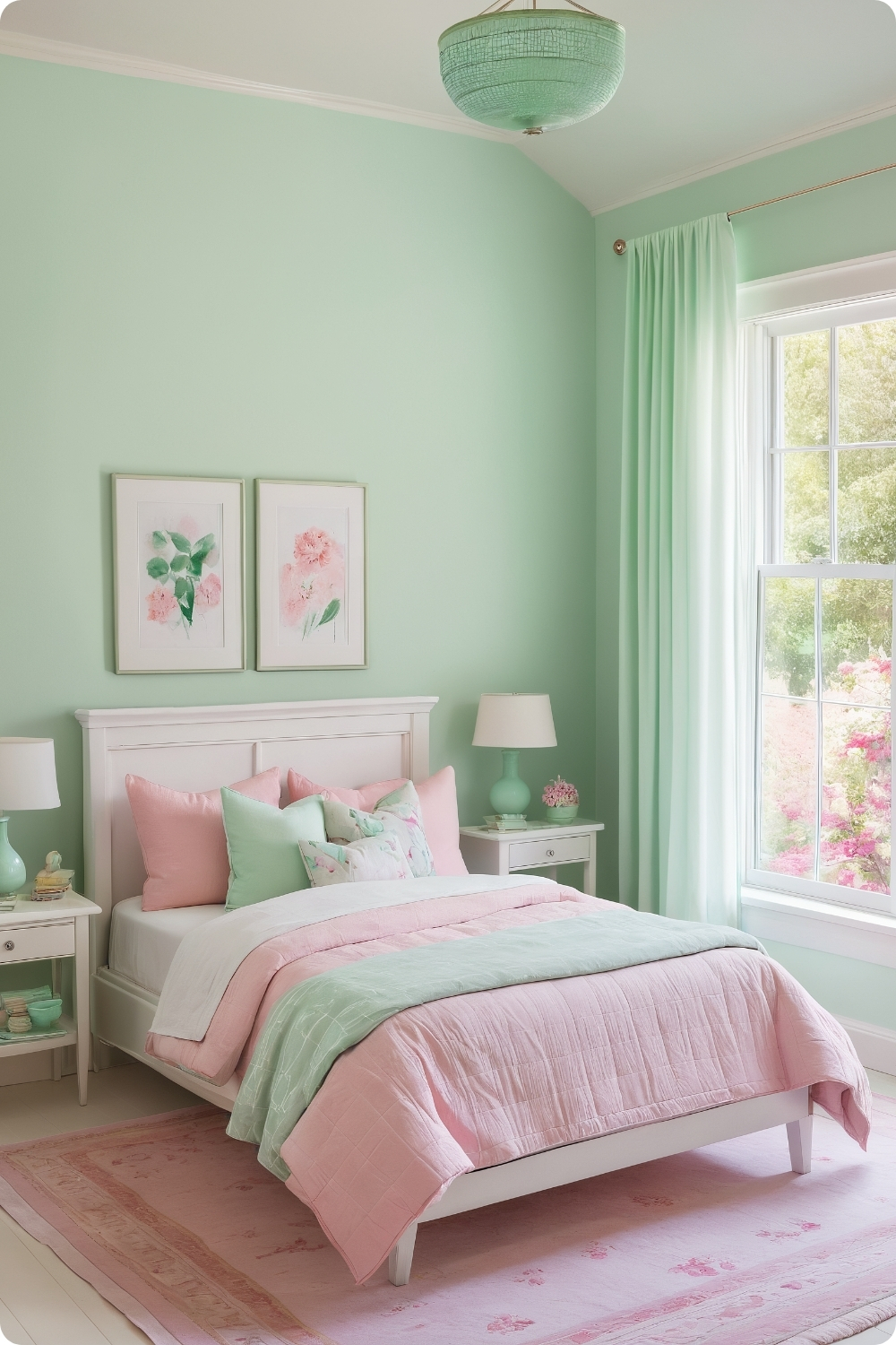
This fresh color combination works particularly well in rooms with abundant natural light, where the soft tones can appear vibrant without artificial enhancement. The key is choosing pastels with similar intensity levels to maintain visual harmony.
Sherwin-Williams’ “Delightful” provides consistent results in various lighting conditions, while many other pastel pinks can appear washed out or overly sweet depending on light exposure throughout the day.
Mint green elements need careful selection since green can easily overwhelm pink in visual weight. I typically use mint in textiles and accessories rather than large furniture pieces to maintain proper color balance.
Watercolor art combining both colors creates cohesive focal points while reinforcing the soft, romantic mood these pastels naturally create. The organic, flowing forms complement the gentle color palette beautifully.
Dramatic and Bold Statements
10. Bubblegum Pink for the Bold
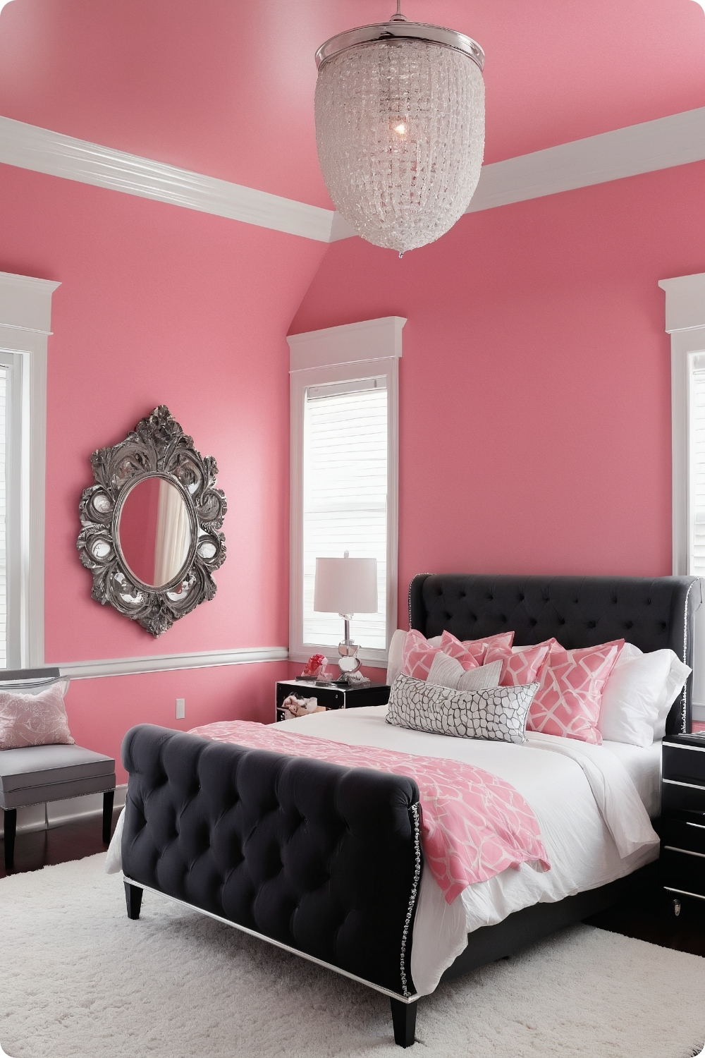
Vibrant bubblegum pink walls require confident clients who understand they’re making a bold design statement. Benjamin Moore’s “Strawberry Freeze” provides consistent coverage but requires high-quality primers to achieve even color saturation.
The psychological impact of intense pink needs consideration for bedroom environments. Some clients find bright pink energizing and uplifting, while others experience it as overstimulating for sleep spaces.
Balancing bright pink walls requires substantial neutral elements to prevent visual fatigue. White trim, neutral furniture, and metallic accents provide necessary visual relief while maintaining the bold character clients desire.
Black and white photography creates striking contrast against bright pink backgrounds while adding sophisticated elements that elevate the overall design beyond childish associations many people have with bright pink.
Luxury Textures and Materials
11. Pink Velvet Headboard
Tufted velvet headboards require understanding fabric grades and construction quality since bedrooms receive daily use and contact. High-quality velvet maintains appearance longer while cheaper alternatives show wear quickly.
The mounting system for substantial upholstered headboards needs proper wall anchoring and consideration of wall construction type. Hollow walls require different mounting approaches than solid masonry or wood frame construction.
Crystal chandeliers complement velvet textures by adding sparkle and light reflection that enhances the rich fabric appearance. The key is scaling chandelier size appropriately to room proportions and ceiling height.
Mirrored nightstands provide glamour while reflecting light around the room, making spaces appear larger and brighter. However, mirrored furniture requires consistent cleaning and careful handling to maintain appearance.
Natural Material Combinations
12. Soft Pink and Natural Wood
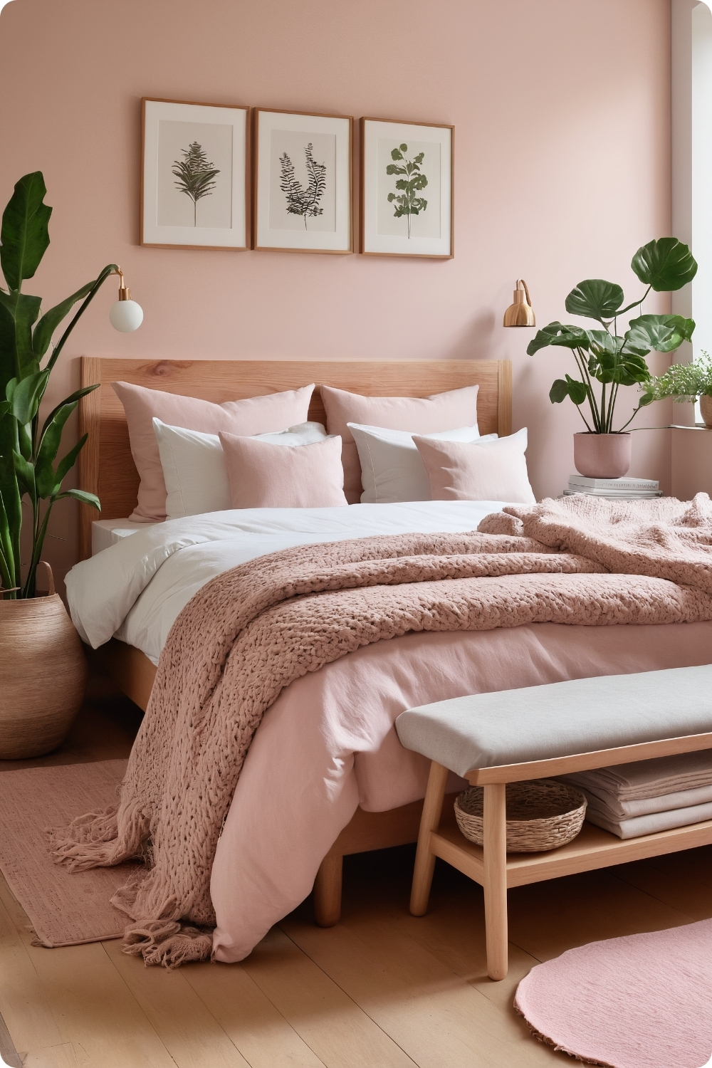
Scandinavian-inspired combinations require understanding wood species and grain patterns that complement rather than compete with soft pink tones. Light woods like ash and birch provide better harmony than darker species.
Farrow & Ball’s “Middleton Pink” works particularly well with natural wood because its complex undertones complement rather than clash with wood grain variations. Many pink paints appear artificial against natural materials.
Platform bed construction in natural wood requires skilled carpentry to achieve clean, minimalist lines while maintaining structural integrity. Poor construction becomes obvious in simple designs without decorative elements to hide imperfections.
Plant integration requires understanding light requirements and how they’ll interact with pink wall colors. Some plants appear unhealthy against pink backgrounds due to color temperature conflicts between artificial pink and natural green tones.
Edgy and Contemporary Approaches
13. Hot Pink and Black: Edgy Glamour
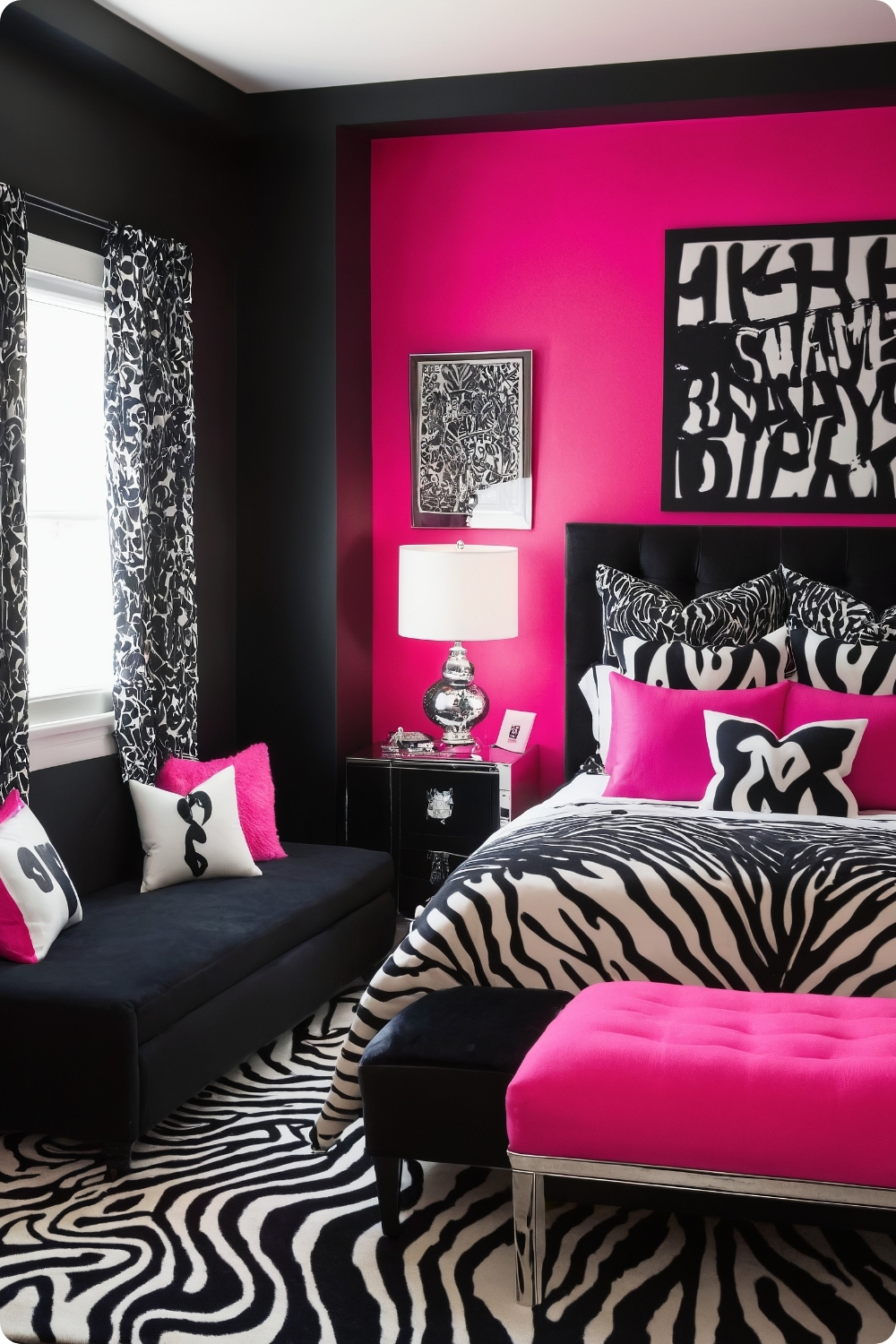
This high-contrast combination requires careful application to avoid overwhelming bedroom environments intended for relaxation. The proportion typically works best with more black than pink to maintain visual balance.
Benjamin Moore’s “Raspberry Mousse” provides vibrant coverage but requires quality primer and multiple coats to achieve even saturation on darker accent walls. The intensity can vary significantly with different lighting conditions.
Silver and chrome accents complement the cool undertones in both hot pink and black, while warm metals like gold can appear jarring against this particular color combination. Hardware selection significantly affects overall aesthetic success.
Sound considerations become important with bold color schemes since they can feel overwhelming in small spaces. Textured elements like shaggy rugs help absorb sound while adding necessary softness to balance hard surfaces.
Themed and Styled Approaches
14. Tropical Pink Paradise
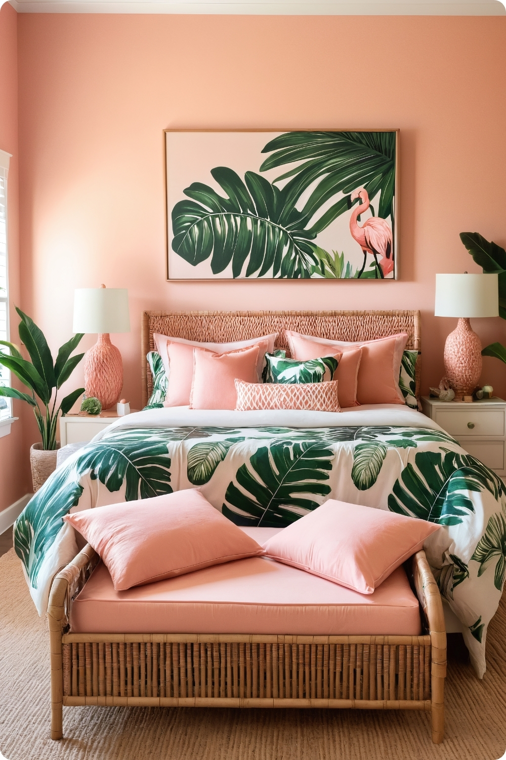
Tropical themes require authentic material selections and plant choices that can realistically thrive indoors. Many tropical plants require high humidity and bright light that typical bedrooms don’t provide.
Peachy pink tones like Sherwin-Williams’ “Cosmetic Peach” work better for tropical themes than cool pinks because they complement the warm undertones in natural rattan and bamboo furniture materials.
Large-scale tropical prints can overwhelm smaller bedrooms, so scale becomes crucial. I typically limit bold prints to bedding or single accent pieces while using solid colors elsewhere.
Monstera and palm plants require specific care including adequate drainage, appropriate potting soil, and regular maintenance that many clients underestimate. Realistic plant selection prevents disappointment and plant failure.
Unexpected Applications
15. Pink Ceiling Surprise
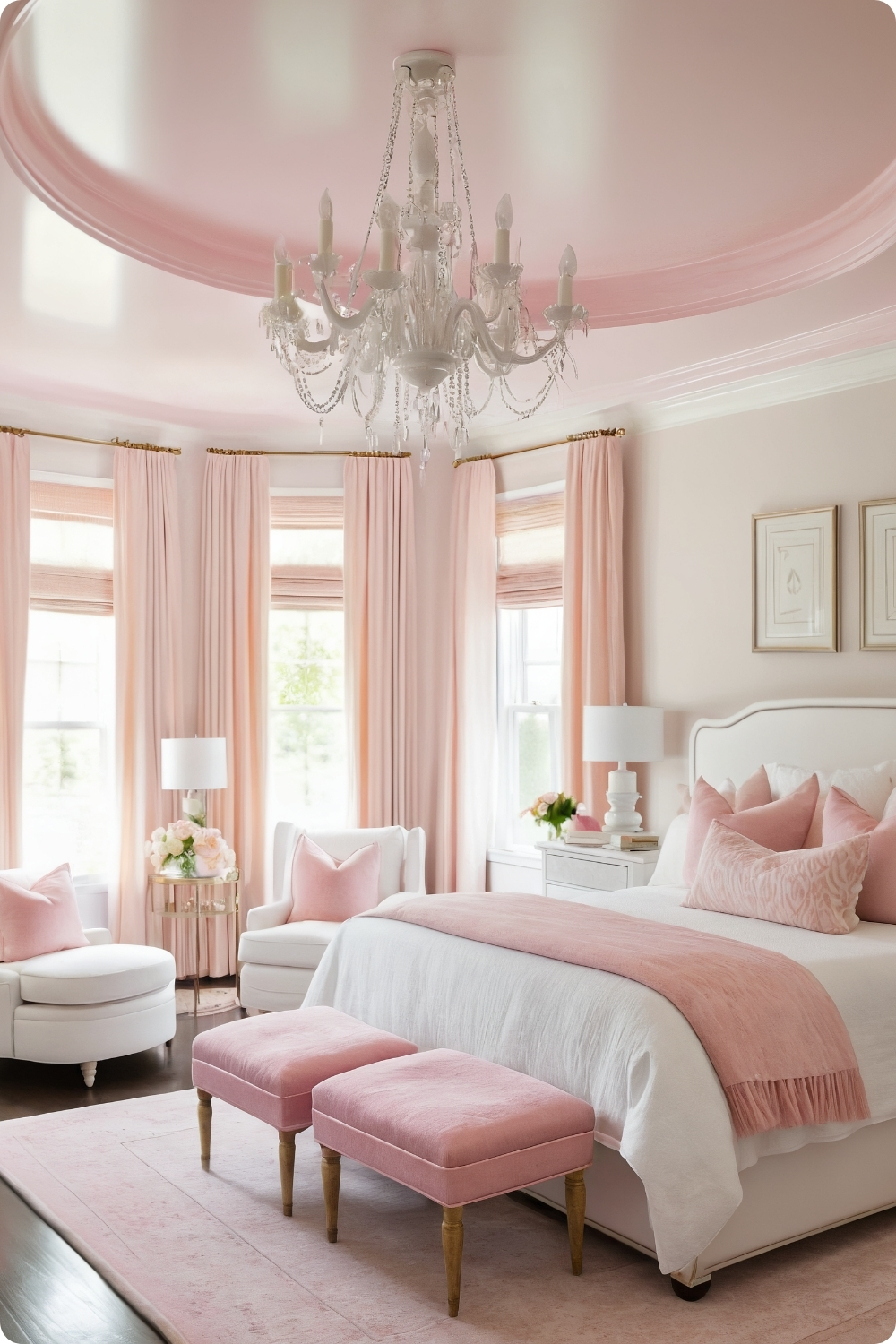
Painting ceilings requires understanding how color affects perceived room height and proportion. Light pinks like Benjamin Moore’s “Pink Cadillac” can make ceilings feel higher, while darker shades create cozier, more intimate feelings.
Ceiling paint requires different application techniques and safety considerations compared to wall painting. Professional painters typically charge premium rates for ceiling work due to physical demands and specialized equipment requirements.
Statement chandeliers or pendant lights become more important when ceilings serve as color focal points. The fixture selection needs to complement rather than compete with the ceiling color while providing adequate task and ambient lighting.
Visual balance requires careful coordination between ceiling color and floor elements. Light-colored flooring works better with pink ceilings, while dark floors can create top-heavy visual weight distribution.
Vintage and Historical Inspirations
16. Vintage Pink Charm
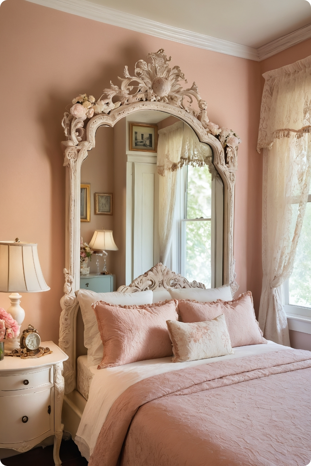
Authentic vintage aesthetics require understanding historical color palettes and furniture styles rather than simply using distressed finishes on contemporary pieces. Farrow & Ball’s “Dead Salmon” references historical pigments and provides authentic character.
Antique white furniture with ornate details requires careful sourcing to find pieces with genuine character rather than mass-produced reproductions. Estate sales and antique auctions often provide better options than retail furniture stores.
Lace curtains and doilies require proper care and maintenance since these delicate textiles can be difficult to clean and repair. Many clients appreciate the aesthetic but underestimate the upkeep requirements.
Vintage accessories need to be genuine rather than artificially aged reproductions to achieve authentic character. Real vintage postcards, books, and advertisements provide better results than new items made to look old.
Modern Color Theory Applications
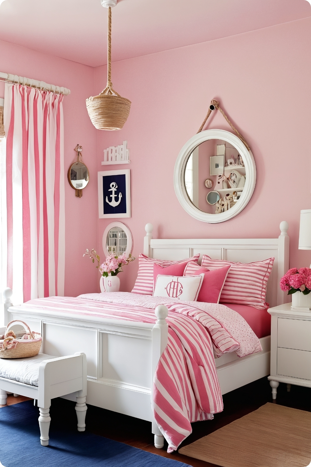
17. Pink and Navy: Nautical Twist
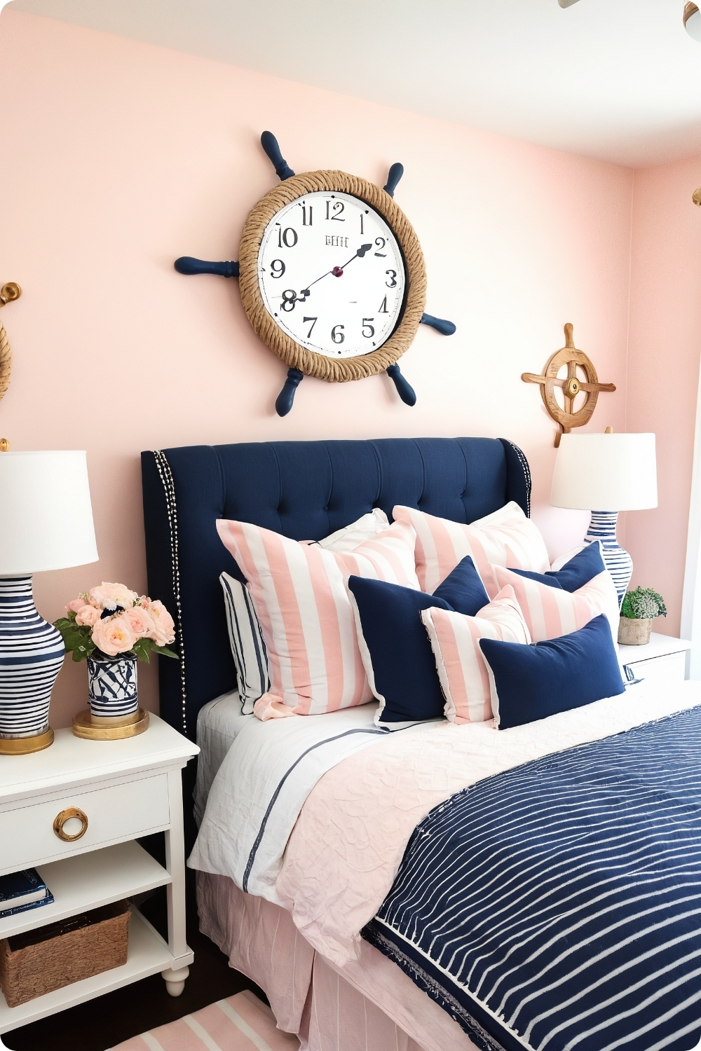
This sophisticated combination works because pink and navy provide sufficient contrast while sharing similar intensity levels. The key is using proper proportions—typically more pink with navy as accent color.
Nautical elements need to feel authentic rather than theme-park obvious. Rope mirrors and anchor wall art can work when chosen for quality and craftsmanship rather than obvious maritime symbolism.
White and pink striped bedding provides pattern interest while maintaining the fresh, clean feeling associated with nautical design. The stripe scale needs appropriate sizing for room proportions and furniture scale.
Gold accents elevate the combination beyond typical nautical themes by adding luxury elements that create sophistication rather than casual beach house aesthetics.
Advanced Color Techniques
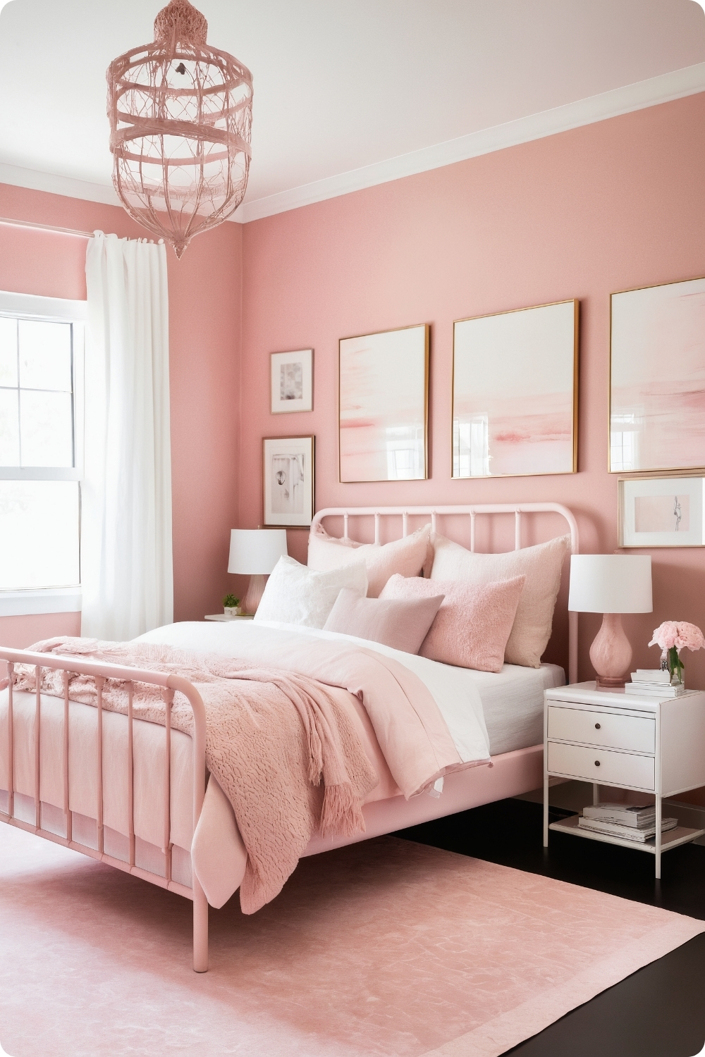
18. Monochromatic Pink Layers
Successful monochromatic schemes require understanding color temperature, intensity, and texture relationships to create interest without additional colors. Various pink shades must share undertones to appear harmonious rather than conflicting.
Texture mixing becomes essential to prevent flatness in single-color schemes. Combining silk, cotton, and velvet textures in different pink tones creates visual richness while maintaining color story unity.
Lighting becomes crucial in monochromatic rooms since color variations depend heavily on light quality and direction. I typically recommend multiple light sources at different heights to create depth and dimension.
Mirrors and crystal elements reflect light while adding sparkle that prevents monochromatic schemes from appearing dull or flat. Strategic placement can make spaces appear larger and more dynamic.
Industrial and Urban Adaptations
19. Industrial Chic with Pink Accents
Softening industrial elements requires understanding material relationships and how they interact visually. Raw concrete and exposed pipes provide masculine balance against feminine pink elements.
Metal bed frames need proper sizing and proportions to work in industrial schemes. Oversized frames can overwhelm spaces, while undersized pieces appear insignificant against substantial architectural elements.
Rose gold metallic finishes bridge industrial and feminine aesthetics by providing warm metallic tones that complement both raw materials and pink accents. The finish needs to appear authentic rather than obviously trendy.
Edison bulb lighting enhances industrial character while providing warm light that complements pink tones. Cool fluorescent lighting can make pink appear harsh and artificial against industrial materials.
Textile and Window Treatments
20. Pink Ombre Curtains
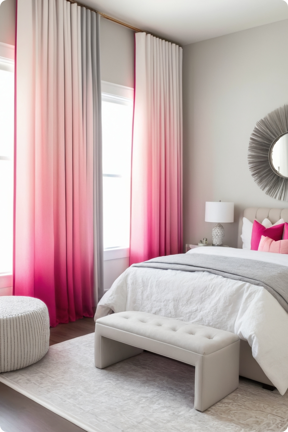
Floor-to-ceiling ombre curtains require precise color gradation and skilled installation to achieve professional results. The color transition needs to appear natural rather than obvious or artificial.
Curtain hardware becomes important since dramatic treatments need proper support and smooth operation. Ceiling-mounted tracks often work better than standard window-mounted rods for floor-to-ceiling installations.
The gradient direction affects how the treatment interacts with room proportions. Light-to-dark top-to-bottom typically makes ceilings appear higher, while reverse gradients can create different visual effects.
Fabric selection affects how well ombre effects translate in use. Some materials show color transitions better than others, and durability requirements for window treatments demand careful material consideration.
Rustic and Country Approaches
21. Rustic Pink Retreat
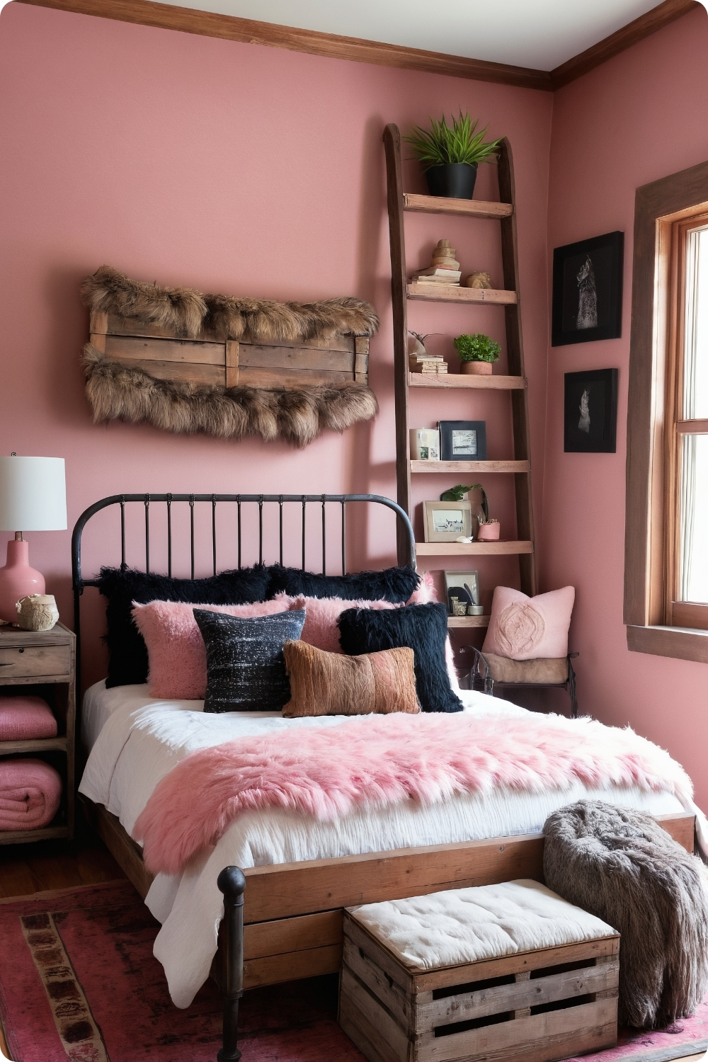
Combining pink with rustic elements requires understanding material authenticity and how different textures interact. Reclaimed wood needs proper preparation and treatment for indoor use while maintaining weathered character.
Benjamin Moore’s “Tissue Pink” provides earthy undertones that complement rather than clash with natural wood grains and wrought iron finishes. Many pink paints appear artificial against authentic rustic materials.
Wrought iron bed frames require proper sizing and authentic construction details to appear genuine rather than mass-produced. Hand-forged details and authentic finishes make significant differences in overall aesthetic success.
Vintage storage solutions like repurposed wooden crates need proper treatment and finishing to function effectively in bedroom environments while maintaining their authentic character and charm.
Modern Metallic Integrations
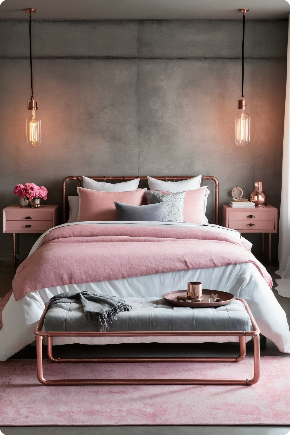
22. Pink and Copper
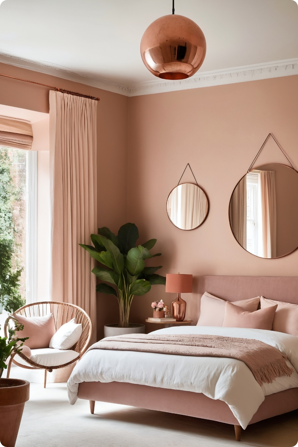
Copper accents require understanding patina development and maintenance requirements. Natural copper aging can be beautiful but unpredictable, while treated copper provides more consistent appearance over time.
Farrow & Ball’s “Setting Plaster” works particularly well with copper because its complex undertones complement rather than compete with copper’s warm metallic properties. Simple pink paints can appear flat against rich copper tones.
Copper planters require proper drainage and protection for indoor use. Many copper vessels aren’t designed for plant growing and need additional waterproofing or liner systems to prevent damage.
Wood furniture selection needs appropriate tones to complement both pink and copper elements. Medium-toned woods typically work better than very light or very dark species.
Playful and Whimsical Elements
23. Playful Pink Polka Dots
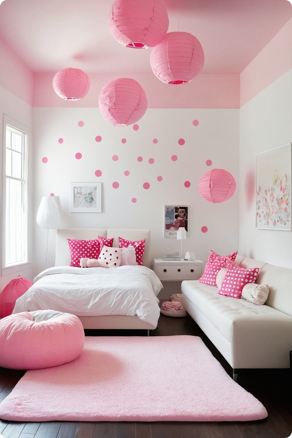
Large-scale polka dot applications require understanding pattern scale relationships and room proportions. Oversized dots can overwhelm small rooms, while tiny dots may disappear and lose visual impact.
Wall decal application requires smooth surfaces and proper installation techniques to achieve professional results. Poor installation shows immediately with geometric patterns like polka dots.
Furniture selection against bold patterns requires restraint and careful color coordination. Too many competing patterns create visual chaos, while solid colors provide necessary balance.
Whimsical elements like bean bag chairs need to serve practical functions rather than just aesthetic ones. Comfort, durability, and storage considerations affect whether playful elements enhance or detract from bedroom functionality.
Romantic and Dreamy Treatments
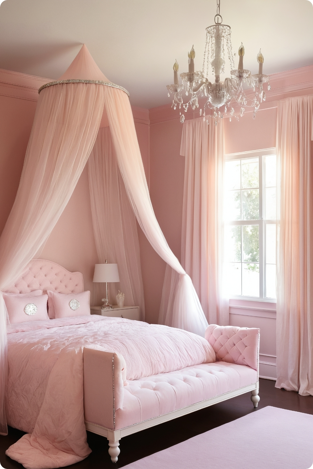
24. Pink Canopy Bed
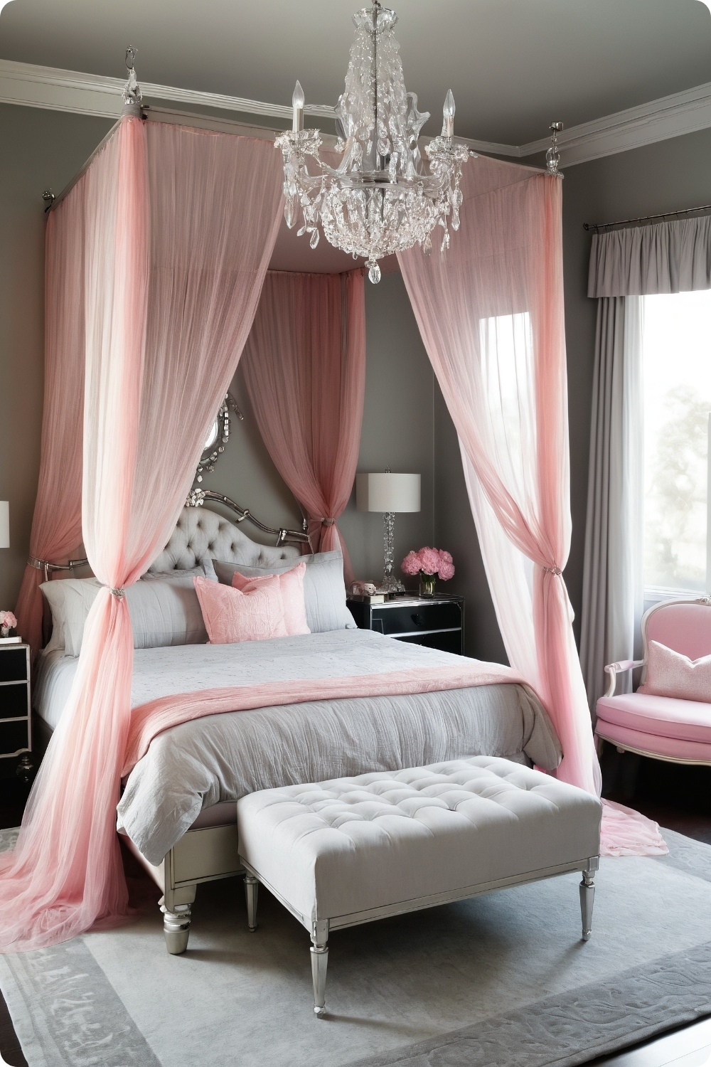
Canopy bed construction requires understanding both aesthetic proportions and structural requirements. Four-poster beds need substantial construction to support draped fabric weight and maintain stability.
Sheer pink fabric selection affects light filtration and privacy levels. Different fabric weights and weaves create varying degrees of enclosure and intimacy within bedroom spaces.
Crystal and glass lighting elements enhance dreamy atmospheres by creating sparkle and light reflection. However, placement needs to consider safety and cleaning accessibility in daily use environments.
Plush rug selection provides softness and comfort but requires understanding maintenance requirements. Light-colored rugs in bedrooms need frequent cleaning and may not be practical for all lifestyles.
Contemporary Trend Applications
25. Millennial Pink and Plants
Instagram-worthy aesthetics require understanding photography and lighting principles as well as interior design. What appears attractive in photos may not function well for daily living.
Sherwin-Williams’ “Intimate White” provides the authentic millennial pink tone but requires proper lighting to achieve the desired effect. Different light sources can make the color appear too yellow or too purple.
Plant selection needs to consider realistic care requirements and how plants will actually look in pink environments. Some plants appear unhealthy against pink backgrounds due to color temperature conflicts.
Minimalist furniture requires exceptional quality and craftsmanship since there are fewer elements to distract from construction details. Poor quality becomes immediately obvious in simplified designs.
Historical Style Interpretations
26. Pink Art Deco Glamour
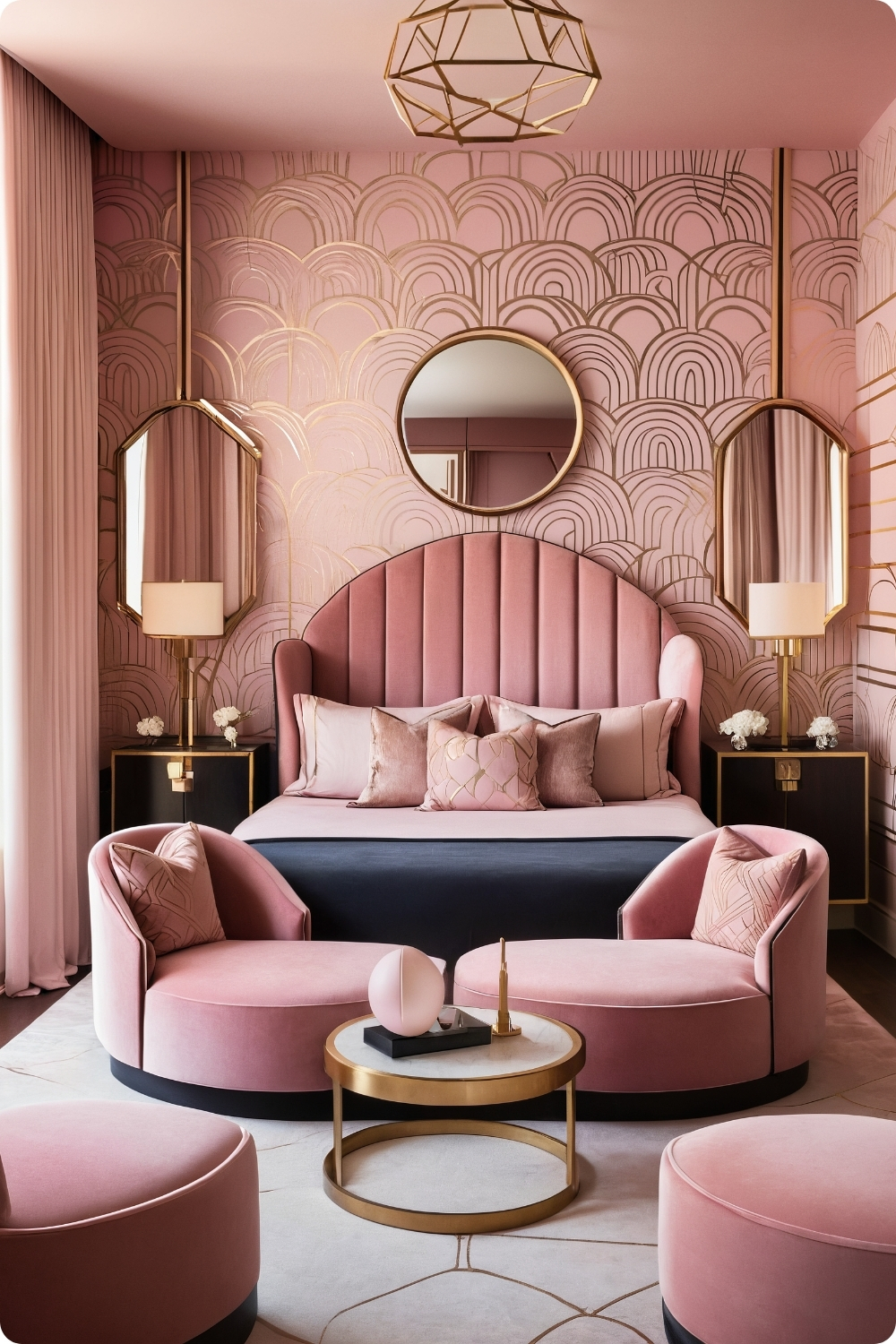
Authentic Art Deco requires understanding geometric proportions and material relationships characteristic of the 1920s and 1930s. Arbitrary geometric patterns don’t create authentic period aesthetics.
Curved furniture lines characteristic of Art Deco require skilled craftsmanship and quality construction. Mass-produced furniture rarely captures the sophisticated details that define authentic Art Deco style.
Luxurious fabrics like velvet and silk require understanding maintenance requirements and durability expectations for bedroom use. These materials can be beautiful but require appropriate care and handling.
Frosted glass lighting fixtures need proper electrical installation and safety considerations. Period-appropriate fixtures often require electrical modifications to meet modern safety codes and standards.
Cottage and Shabby Chic Styles
27. Shabby Chic Pink
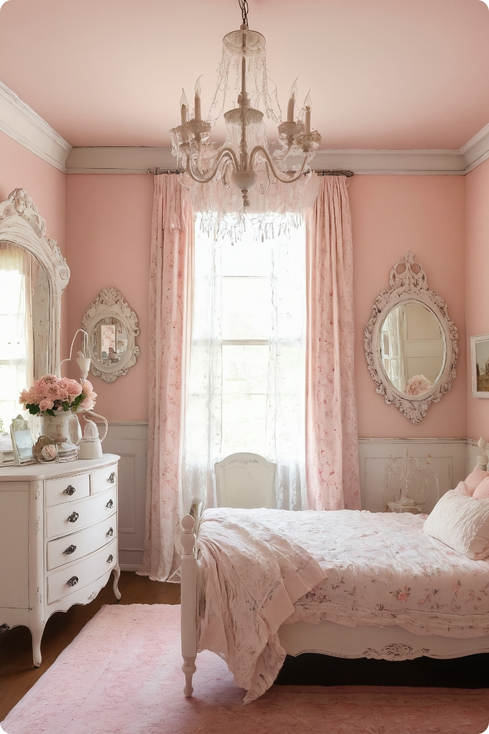
Authentic shabby chic requires understanding aging processes and how furniture develops character over time. Artificially distressed pieces often appear obviously fake compared to naturally aged materials.
Benjamin Moore’s “Love & Happiness” provides appropriate vintage character while maintaining sufficient coverage for contemporary application. Many vintage-inspired colors lack durability for modern use.
Distressed furniture finishing requires skill to achieve convincing results. Poor distressing techniques create obviously artificial appearances that undermine the authentic aesthetic.
Chalk paint applications need proper preparation and finishing to achieve durability for furniture that receives daily use. These finishes can be beautiful but require appropriate application and maintenance.
Bold Color Blocking Approaches
28. Pink and Teal Color Block
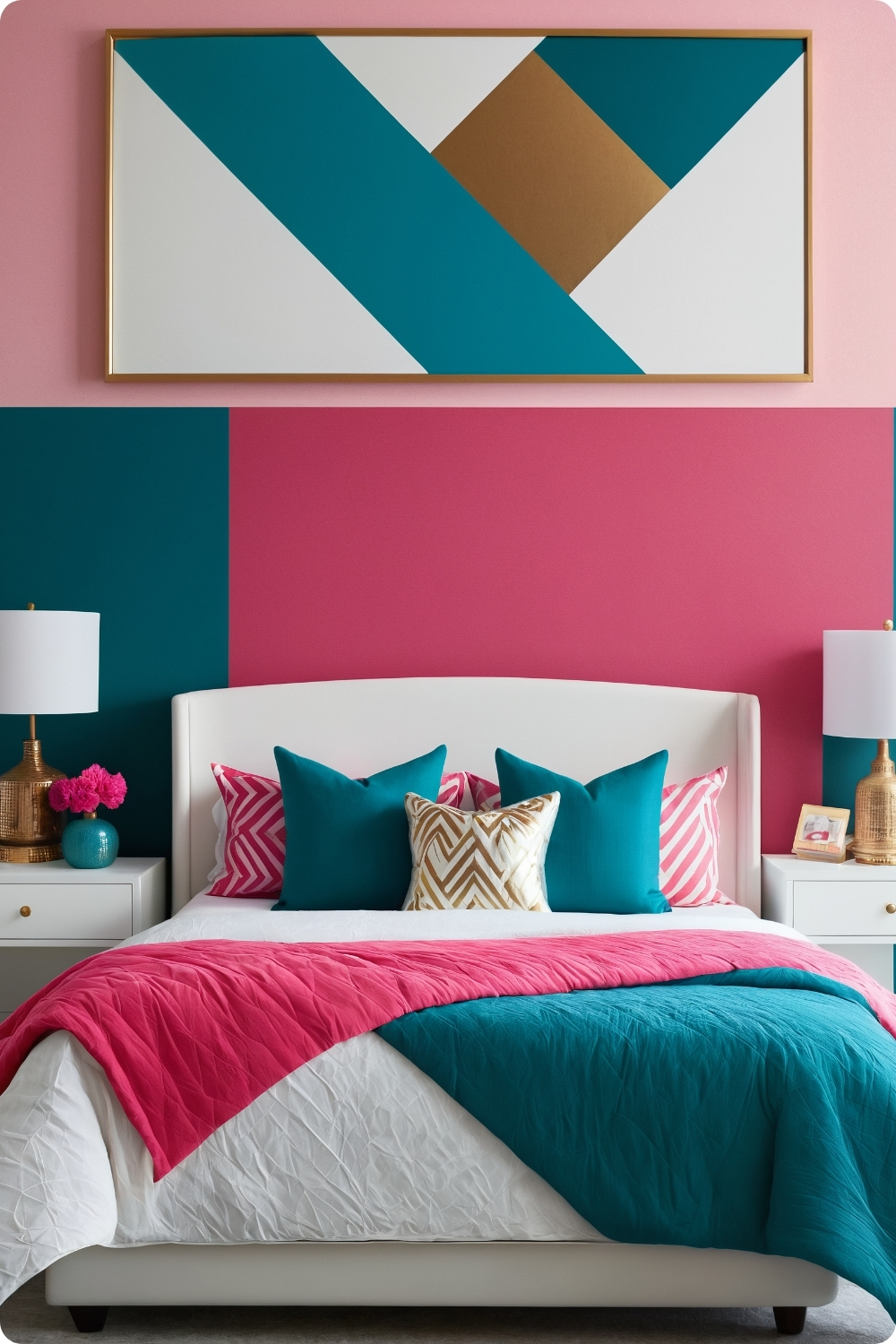
Color blocking requires understanding geometric relationships and how bold colors interact visually. Diagonal divisions often work better than straight horizontal or vertical splits.
Sherwin-Williams’ “Fond Farewell” paired with deep teal creates strong contrast but requires careful proportion management to avoid overwhelming bedroom environments intended for rest and relaxation.
Modern white furniture provides necessary visual relief against bold color combinations while maintaining clean lines that complement contemporary color blocking approaches.
Metallic accents in gold or copper help bridge contrasting colors by providing warm tones that complement both pink and teal. The metallic elements create visual connections between otherwise disparate colors.
Cultural and Global Inspirations
29. Pink Moroccan Inspired
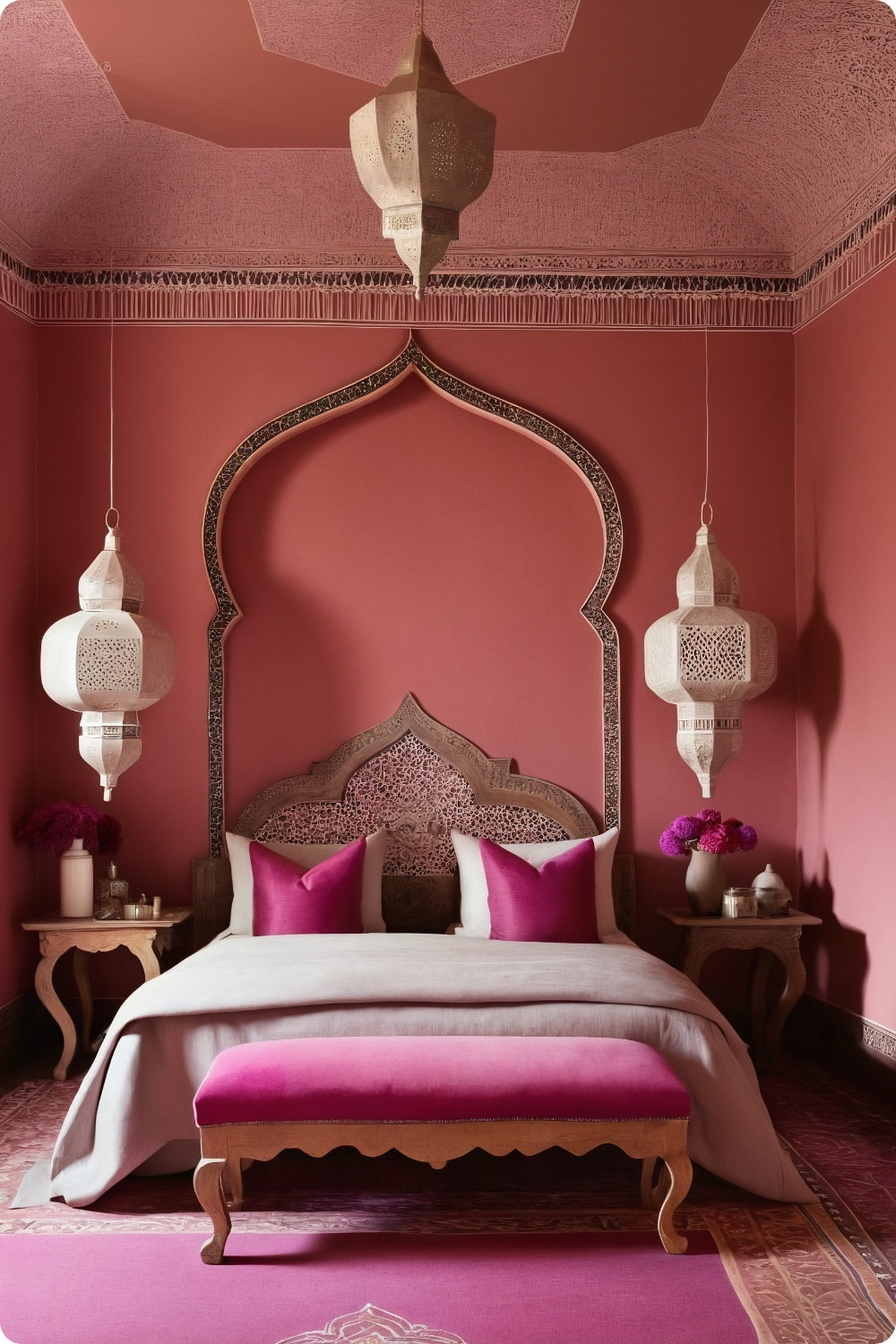
Authentic Moroccan influences require understanding cultural traditions and avoiding superficial appropriation. Quality handcrafted elements work better than mass-produced items with generic “Moroccan” styling.
Farrow & Ball’s “Pink Ground” provides appropriate warmth and complexity for Moroccan-inspired spaces. Simple pink paints often appear flat against rich textiles and intricate patterns characteristic of Moroccan design.
Moroccan rugs require understanding weaving traditions and quality indicators. Authentic pieces provide better longevity and character than machine-made reproductions with similar visual elements.
Carved wooden elements need proper treatment for indoor use while maintaining authentic character. Many imported pieces require additional finishing or protection for long-term durability in home environments.
Specialized Theme Applications
30. Ballerina Pink and Tulle
Dance-inspired themes require understanding practical considerations alongside aesthetic goals. Tulle canopies can collect dust and may not be practical for all bedroom users.
Benjamin Moore’s “Pink Bliss” provides appropriate softness for ballet themes while maintaining sufficient color depth to avoid appearing washed out under various lighting conditions.
Tufted headboards require quality construction and fabric selection to maintain appearance with regular use. Button tufting can loosen over time without proper construction techniques and quality materials.
Ethereal treatments need to function practically for daily bedroom use rather than just creating photogenic moments. Maintenance, cleaning, and durability considerations affect long-term satisfaction.
Animal Pattern Integrations
31. Pink and Animal Print
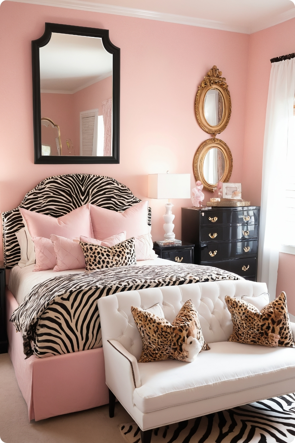
Animal print integration requires restraint and quality selection to avoid appearing costume-like. Authentic-looking prints work better than obviously artificial or cartoon-like patterns.
Leopard and zebra prints work because they contain natural color variations that complement pink tones. The key is using animal prints sparingly as accent elements rather than dominant patterns.
Behr’s “Cute Button” provides appropriate softness to balance bold animal prints without appearing too sweet or juvenile for sophisticated bedroom environments.
Gold accents elevate animal print combinations by adding luxury elements that create sophistication rather than wild or primitive associations that animal prints might otherwise suggest.
Futuristic and High-Tech Approaches
32. Futuristic Pink and Silver
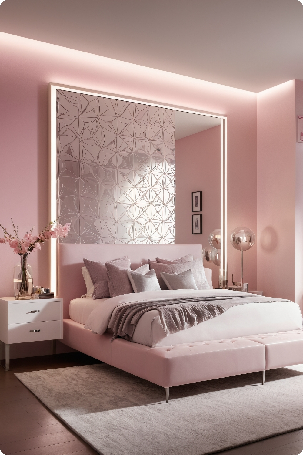
Cool-toned pinks work better with silver metallic elements than warm pinks, which can create jarring contrasts with silver’s inherent coolness. Color temperature matching becomes crucial for sophisticated results.
LED strip lighting requires proper installation and consideration of heat generation and electrical requirements. These systems often need dedicated controls and appropriate dimming capabilities for bedroom use.
Glossy finishes in white and silver require exceptional maintenance since they show fingerprints, dust, and imperfections more readily than matte alternatives. Maintenance expectations need realistic assessment.
Geometric shapes and patterns need to reference established design principles rather than arbitrary forms. Mathematical relationships like golden ratios create more pleasing and sophisticated geometric compositions.
Pastel Harmony Applications
33. Pink and Lavender Pastel Dream
Pastel combinations require similar intensity levels and undertone compatibility to appear harmonious. Benjamin Moore’s “Pink Beach” provides appropriate softness while maintaining enough color depth for bedroom applications.
Texture integration becomes essential in pastel schemes to prevent flatness and add visual interest. Velvet, faux fur, and gauze fabrics create tactile variety while maintaining color story continuity.
Light wood furniture maintains airy feelings characteristic of successful pastel schemes while providing natural warmth that prevents spaces from appearing cold or sterile.
Watercolor art techniques complement pastel color schemes by providing organic, flowing forms and color blending that reinforce the soft, dreamy mood these colors naturally create.
Nature-Inspired Themes
34. Cherry Blossom Inspired
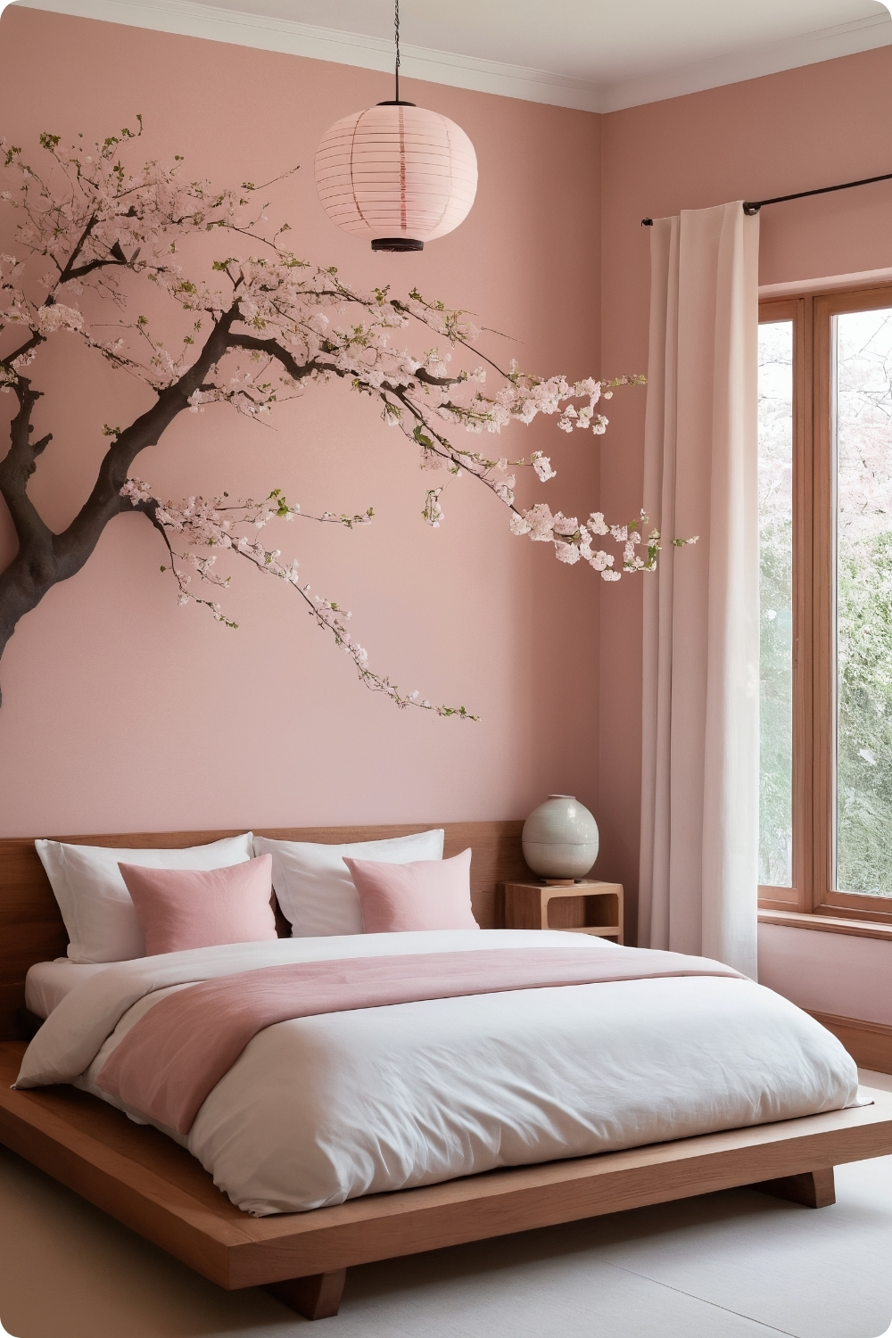
Japanese-inspired design requires understanding cultural principles and aesthetic philosophy rather than simply using surface decorations. Authentic approaches emphasize simplicity, natural materials, and harmony with nature.
Farrow & Ball’s “Calamine” provides appropriate warmth for cherry blossom themes while maintaining the subtle complexity that characterizes authentic traditional color palettes.
Low-profile furniture requirements need skilled construction to achieve clean lines while maintaining structural integrity. Simple designs reveal construction quality more readily than ornate pieces.
Natural elements like bonsai trees require understanding care requirements and commitment to ongoing maintenance. These living elements need realistic care planning rather than just aesthetic consideration.
High-Contrast Combinations
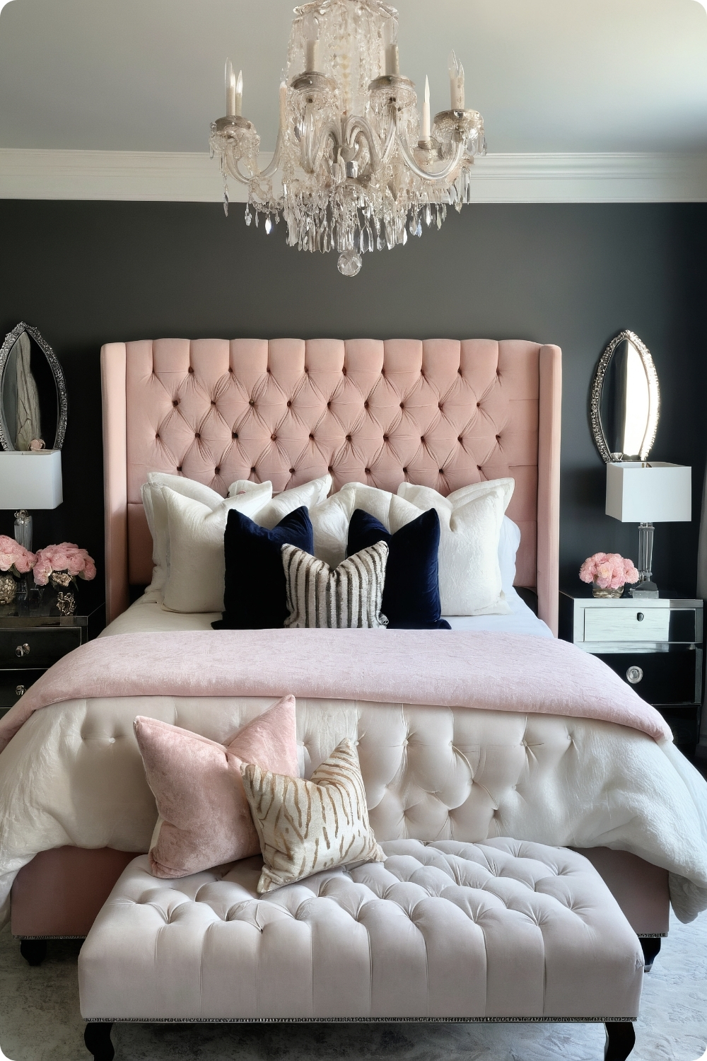
35. Pink and Charcoal Contrast
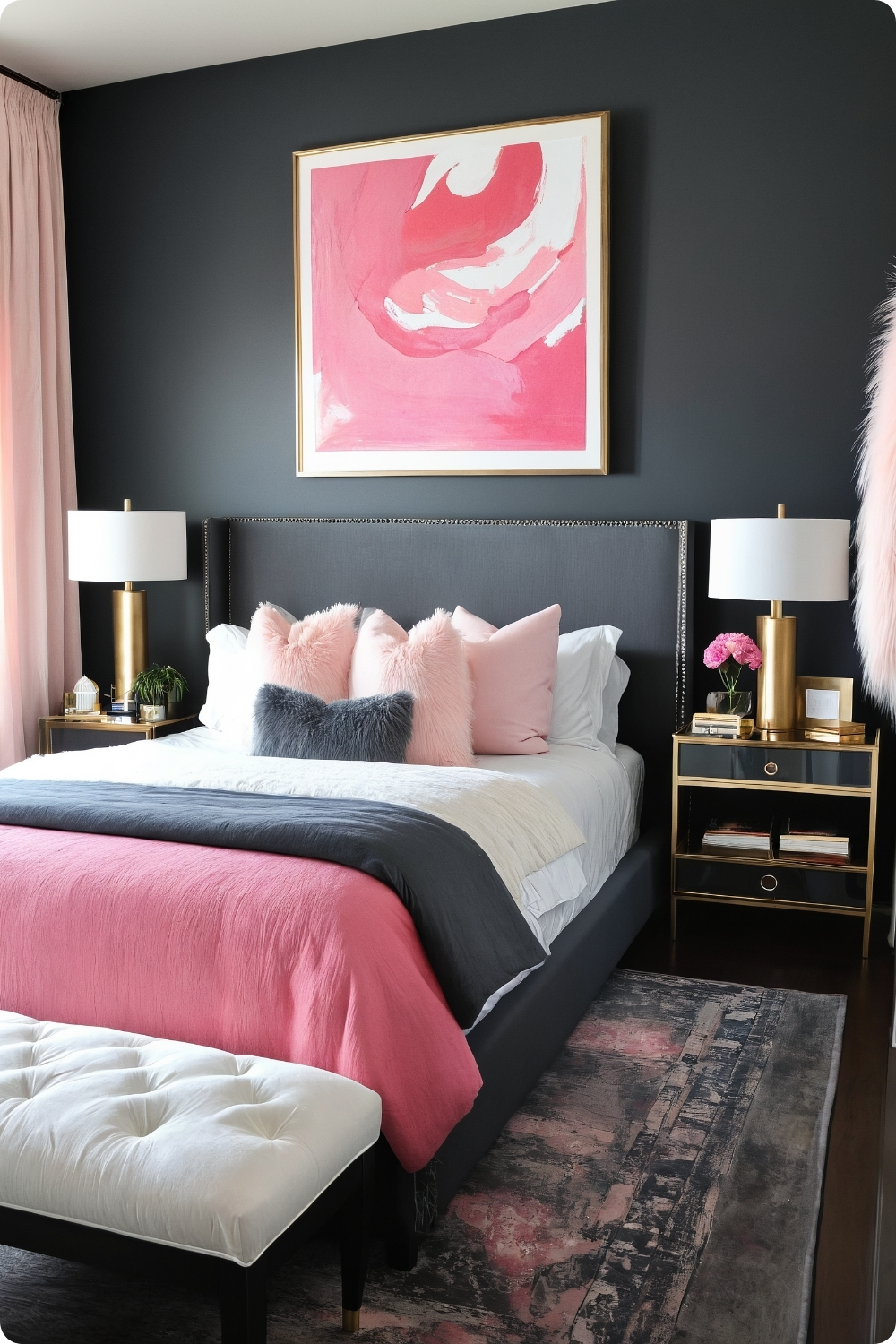
Deep charcoal backgrounds like Benjamin Moore’s “Kendall Charcoal” create dramatic foundations that make pink elements appear more vibrant through contrast effects.
Pink upholstered headboards against dark walls create strong focal points but require quality construction and fabric selection to maintain appearance with regular use and contact.
Medium to dark wood furniture provides appropriate weight and warmth against both charcoal and pink elements while maintaining visual balance between competing strong colors.
Brass or gold metallic accents bridge pink and charcoal by providing warm tones that complement both colors while adding luxury elements that elevate the overall sophistication level.
Specialty Lighting Applications
36. Neon Pink Light Fixtures
Neon lighting requires professional electrical installation and consideration of electrical consumption, heat generation, and safety requirements. These installations often need dedicated circuits and appropriate ventilation.
Statement lighting needs appropriate scaling to room proportions and ceiling height. Oversized fixtures can overwhelm bedroom environments, while undersized pieces lack necessary visual impact.
LED strip lighting applications require understanding placement strategies for even light distribution and color consistency. Poor installation creates obvious hot spots and uneven illumination.
Reflective surfaces like mirrors and metallic accents enhance lighting effects by bouncing light around rooms and creating sparkle and visual interest that complement dramatic lighting treatments.
Textural Wall Treatments
37. Pink Textured Walls
Textured wall treatments require skilled application and understanding of how different techniques affect maintenance and durability. Some textures collect dust and are difficult to clean in bedroom environments.
Color washing and sponge painting techniques require practice and skill to achieve professional results. Poor execution creates obvious patterns and artificial appearances that detract from intended effects.
Modern furniture selection provides clean contrast against textured walls while maintaining sophisticated aesthetics. Too much texture competition creates visual chaos and reduces restful qualities.
Natural texture integration through jute, linen, and raw wood complements wall textures while adding tactile variety and warmth that enhances bedroom comfort and appeal.
Cheerful Color Combinations
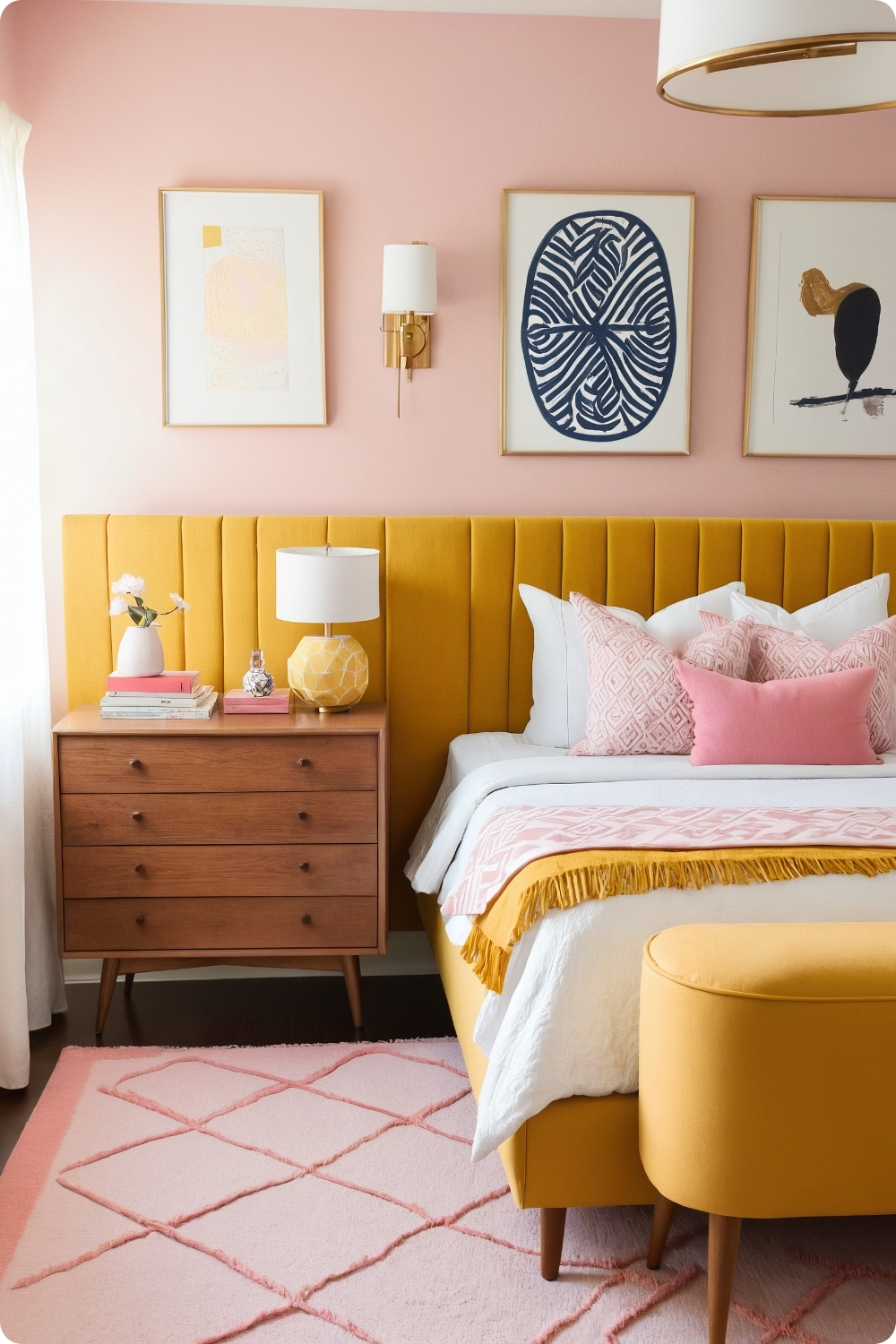
38. Pink and Yellow Sunshine
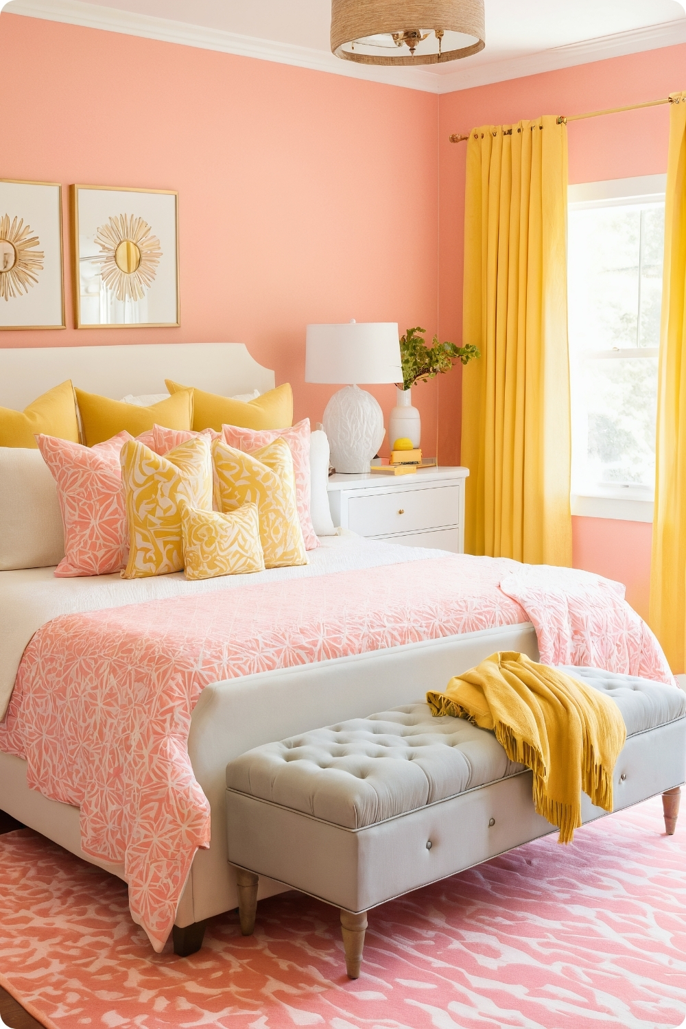
Bright color combinations require careful proportion management to avoid overwhelming bedroom environments intended for rest and relaxation. More neutral base colors with bright accents typically work better than equal bright proportions.
Sherwin-Williams’ “Mellow Coral” provides appropriate warmth for yellow combinations while maintaining pink character. Many pink paints clash with yellow due to undertone conflicts.
White balance becomes crucial in bright color schemes to provide visual relief and prevent sensory overload. Adequate neutral areas allow eyes to rest between colorful elements.
Playful elements like sunburst mirrors need quality construction and appropriate sizing to enhance rather than detract from overall sophistication and adult bedroom appeal.
Glamorous Luxury Applications
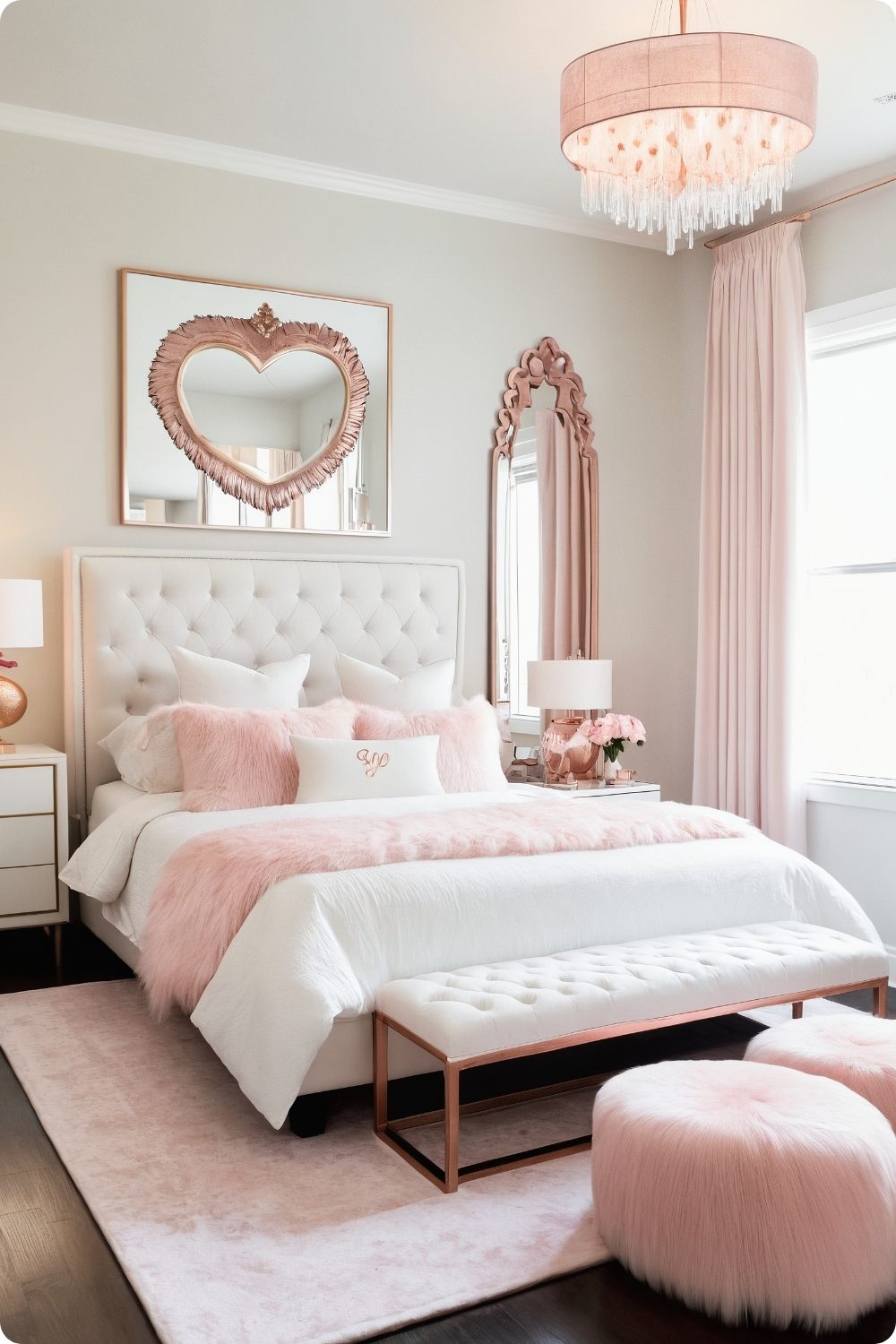
39. Glam Pink with Mirrored Furniture
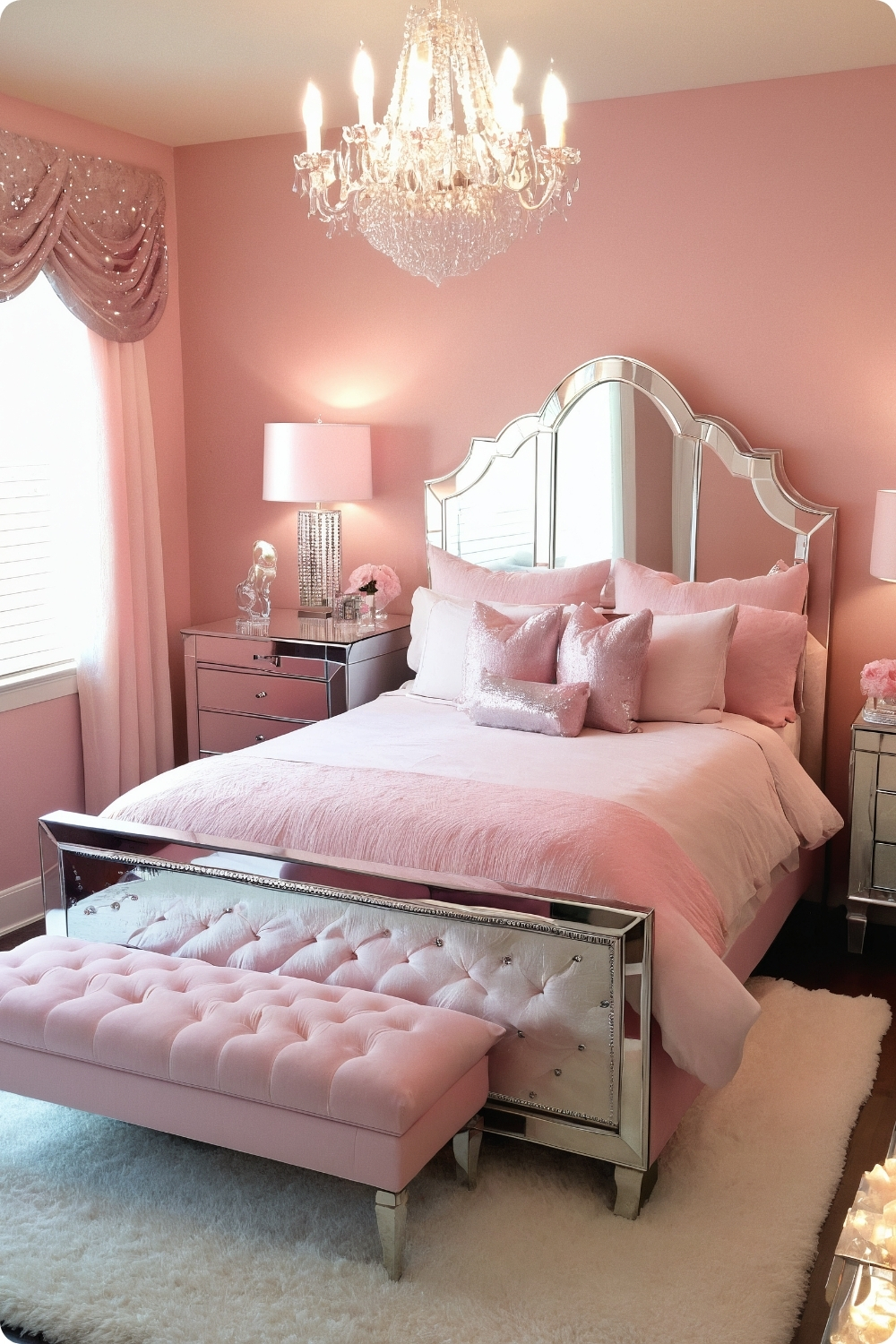
Mirrored furniture requires understanding maintenance requirements and safety considerations. Glass surfaces need regular cleaning and careful handling to maintain appearance and prevent damage.
Benjamin Moore’s “Powder Pink” provides appropriate sophistication for glamorous applications while maintaining enough color depth to complement rather than compete with reflective surfaces.
Crystal chandeliers need proper electrical installation and ceiling support calculations. These substantial fixtures often require structural modifications and dedicated electrical circuits for safe operation.
Sequined and metallic textile elements add sparkle and glamour but may have durability limitations with regular use. Quality selection affects long-term satisfaction and maintenance requirements.
Urban Industrial Adaptations
40. Pink Exposed Brick
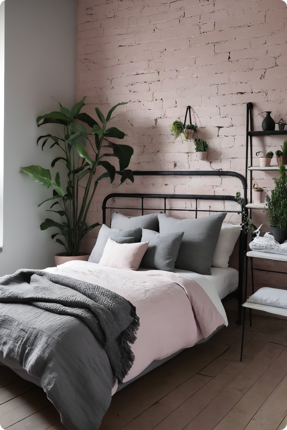
Painted brick applications require understanding brick porosity and proper preparation to achieve even coverage and long-term durability. Different brick types accept paint differently.
Farrow & Ball’s “Setting Plaster” works well on brick because its complex undertones complement rather than clash with natural brick color variations and texture irregularities.
Industrial metal furniture provides appropriate contrast against soft pink brick while maintaining authentic urban character. Quality construction becomes important since industrial styles emphasize function.
Plant integration and natural wood elements soften industrial edges while maintaining authentic character. These organic elements provide necessary warmth and comfort for bedroom environments.
Classic Pattern Applications
41. Pink and White Stripes
Stripe applications require understanding pattern scale relationships and room proportions. Wide stripes work better in larger rooms, while narrow stripes can make small spaces appear cramped.
Paint application for stripes requires precise measuring and quality tape to achieve clean lines. Poor execution creates obvious imperfections that detract from the crisp, preppy aesthetic.
Solid pink bedding provides necessary balance against striped walls while maintaining color story continuity. Too many competing patterns create visual chaos and reduce restful qualities.
Preppy elements like monogrammed accessories need quality execution and appropriate sizing to enhance rather than detract from sophisticated adult bedroom aesthetics.
Artistic Wall Treatments
42. Watercolor Pink Walls
Watercolor effects require understanding paint techniques and color blending to achieve organic, artistic appearances. Poor execution creates obvious artificial patterns that detract from intended artistic effects.
Multiple pink paint shades need compatible undertones and similar quality levels to blend successfully. Different paint formulations can create unpredictable results when mixed or layered.
Neutral furniture selection allows watercolor walls to serve as primary focal points while maintaining sophisticated aesthetics appropriate for adult bedrooms rather than children’s spaces.
Watercolor artwork and accessories reinforce artistic themes while providing color continuity and visual connections between wall treatments and room furnishings.
Retro Color Revival
43. Pink and Mustard Yellow
Retro color combinations require understanding historical color relationships and proportional applications that characterized specific time periods. Random color combinations don’t create authentic period aesthetics.
Sherwin-Williams’ “Demure” provides appropriate muted tones for retro applications while maintaining contemporary sophistication and avoiding overly obvious vintage references.
Mid-century modern furniture requires authentic proportions and construction details to achieve convincing period character. Mass-produced reproductions often lack sophisticated details that define quality design.
Geometric patterns need to reference authentic historical designs rather than arbitrary modern interpretations. Understanding pattern development and cultural context creates more convincing period aesthetics.
Luxurious Texture Applications
44. Pink Faux Fur Accents
Faux fur quality varies significantly, and premium options provide better appearance and durability for bedroom applications. Cheap faux fur appears obviously artificial and wears poorly.
Large faux fur rugs require understanding maintenance requirements and realistic expectations about appearance changes with use. These luxurious elements need appropriate care to maintain appeal.
Sleek modern furniture provides necessary contrast against plush textures while maintaining sophisticated aesthetics. Too many competing textures create visual chaos and reduce restful qualities.
Rose gold and copper metallic accents complement pink fur by providing warm metallic tones that enhance rather than compete with the luxurious textile elements.
Custom Furniture Applications
45. Pink Gradient Furniture

Ombre furniture finishing requires exceptional skill to achieve smooth color transitions and professional durability. Poor execution creates obvious banding and artificial appearances.
Large furniture pieces like dressers and wardrobes provide better surfaces for gradient treatments than smaller items where the effect might be lost or appear gimmicky.
Neutral wall backgrounds allow gradient furniture to serve as primary focal points while maintaining sophisticated color relationships throughout the bedroom environment.
Premium materials and expert craftsmanship become essential since gradient treatments draw attention to construction quality and finishing details that simpler treatments might hide.
Natural Material Integration
46. Pink and Bamboo
Bamboo furniture requires understanding quality indicators and construction methods since bamboo furniture varies significantly in durability and appearance. Quality bamboo provides better longevity than cheap alternatives.
Benjamin Moore’s “Ash Pink” provides earthy undertones that complement rather than clash with natural bamboo grain and color variations.
Natural plant integration requires realistic care planning and understanding how plants interact with pink backgrounds. Some plants appear healthier against natural materials than artificial color backgrounds.
Eco-chic aesthetics require authentic material selections rather than synthetic alternatives that might appear similar but lack the environmental benefits and natural character of genuine materials.
Typography and Graphic Elements
47. Neon Pink Typography
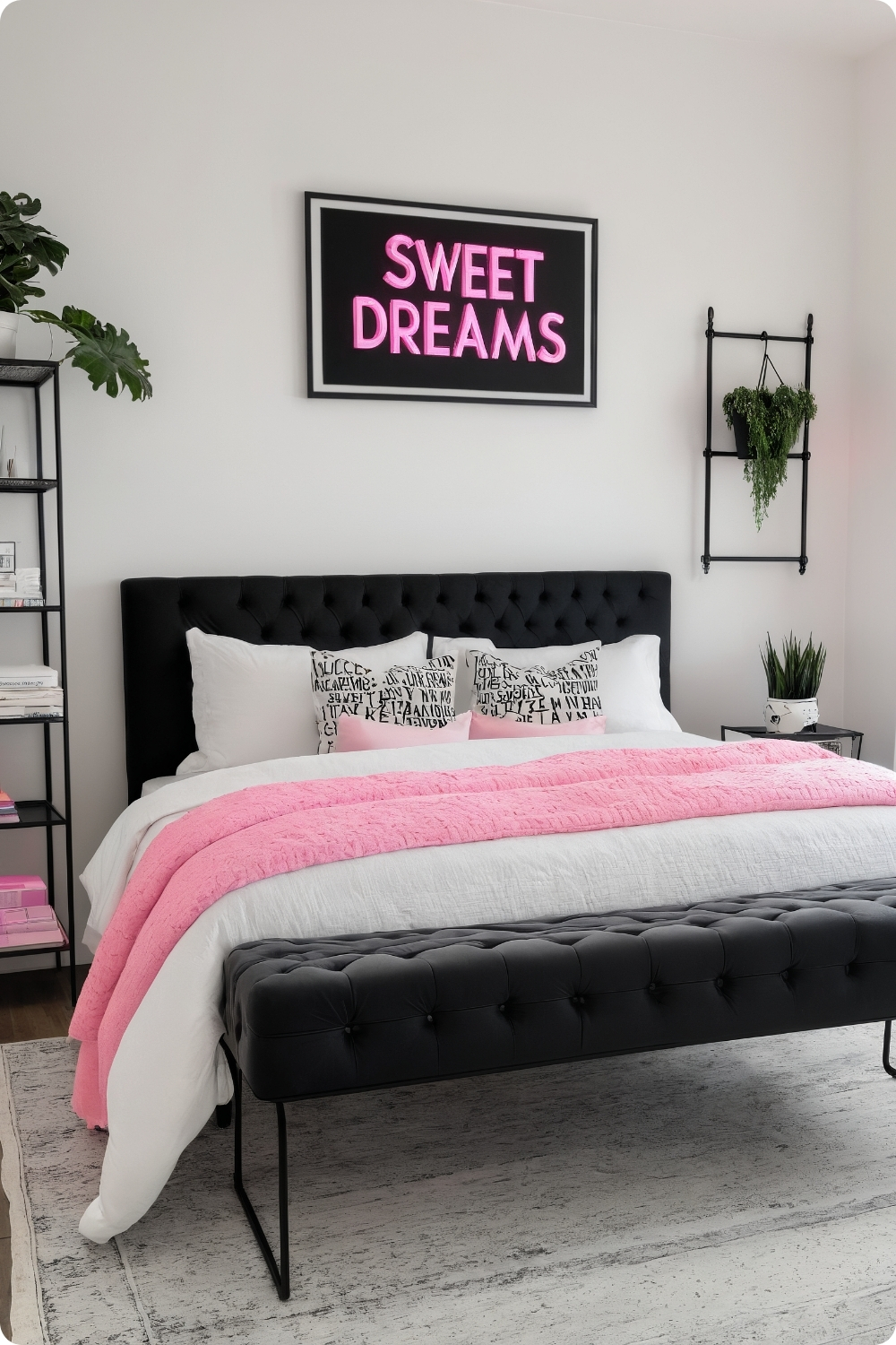
Typography applications require understanding legibility, scale relationships, and how text elements function in bedroom environments. Neon signs with inspiring quotes need appropriate sizing to remain readable without overwhelming sleeping spaces.
Professional neon installation requires electrical expertise and safety considerations including heat generation, electrical consumption, and proper mounting for wall-hung elements. Custom neon work often costs significantly more than clients expect.
Complementary typography elements through throw pillows and framed prints need coordinated fonts and sizing to create cohesive design themes rather than random text collections that lack visual unity.
Black accent elements provide necessary contrast against bright neon pink while adding sophisticated elements that prevent the space from appearing juvenile or overly trendy.
Whimsical Ceiling Treatments
48. Pink Cloud Ceiling
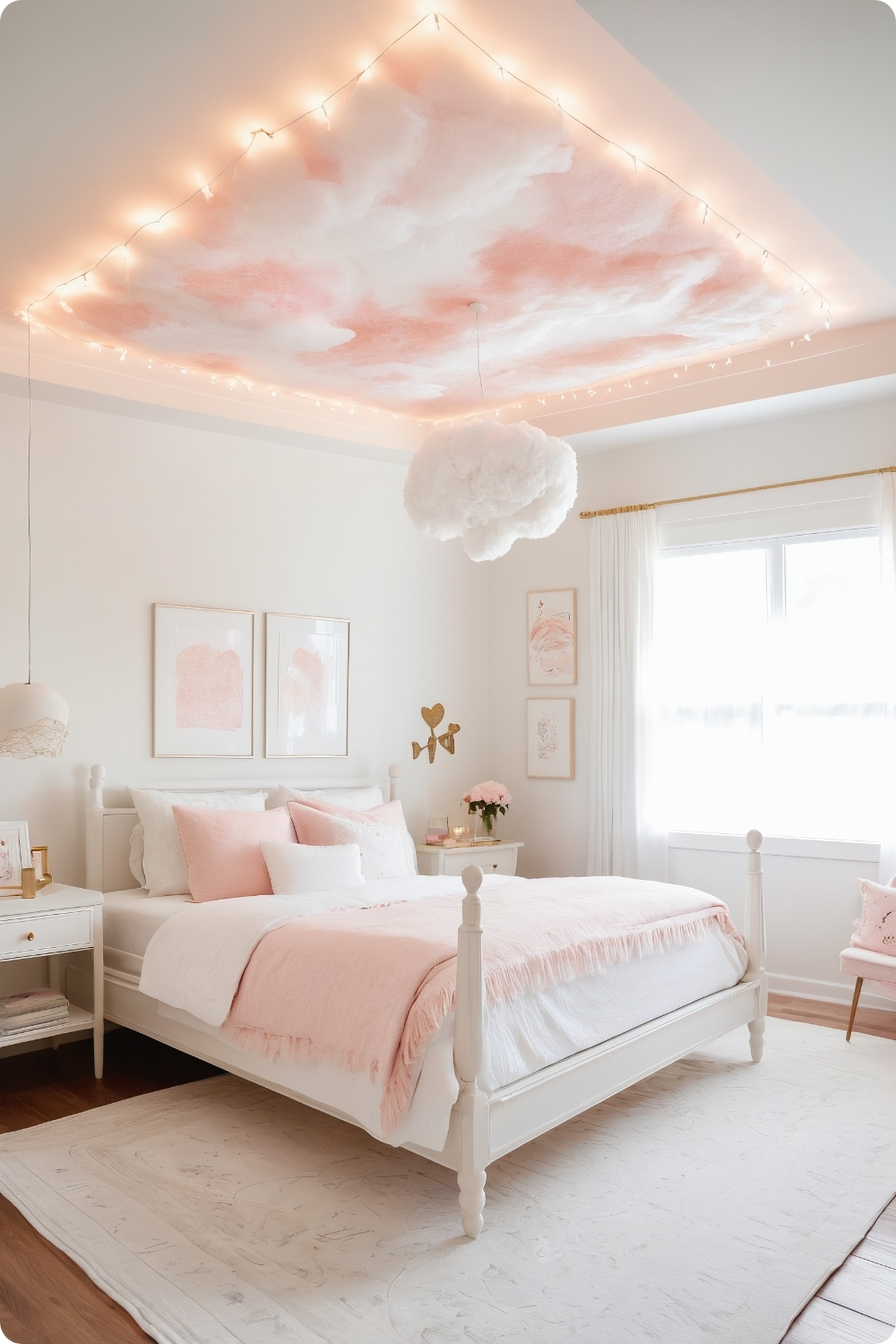
Cloud-like ceiling treatments require skilled application techniques to achieve believable organic patterns rather than obvious artificial textures. Sponging techniques need practice and quality materials for professional results.
Very pale pink applications on white bases create subtle effects that enhance rather than overwhelm bedroom environments intended for rest and relaxation. Heavy-handed application can create jarring effects.
Light wood and white furniture maintains airy feelings characteristic of cloud-inspired themes while providing necessary visual anchoring that prevents spaces from appearing insubstantial or temporary.
Dreamy lighting elements like star-shaped string lights need safe electrical installation and appropriate placement to enhance rather than compete with ceiling treatments.
Dedicated Reading Areas
49. Pink Reading Nook
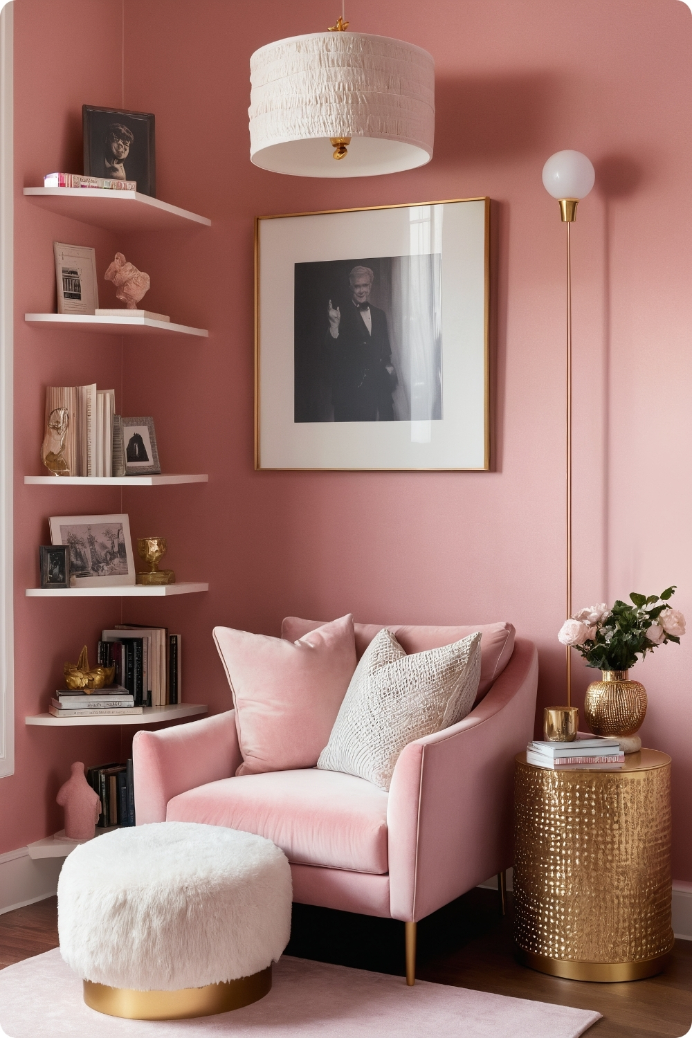
Dedicated reading corners require understanding lighting requirements, seating comfort, and storage needs for books and reading accessories. Task lighting becomes crucial for extended reading sessions.
Corner paint treatments in slightly deeper pink shades need careful color matching and skilled application to achieve smooth transitions between different wall colors within the same room.
Pink velvet upholstery requires understanding maintenance requirements and fabric durability for seating that receives regular use. Quality fabric selection affects long-term satisfaction and appearance.
Floor-to-ceiling bookshelf installation requires understanding wall construction and proper mounting for substantial weight loads. Books create significant accumulated weight that requires appropriate structural support.
My Professional Insights and Recommendations
Through years of designing pink bedrooms, I’ve learned that success depends on understanding color psychology, lighting effects, and how different pink tones interact with other materials and colors. The most successful pink bedrooms feel sophisticated and restful rather than overwhelming or juvenile.
Quality paint selection makes significant differences in both application and long-term appearance. Premium paints with complex undertones age better and maintain color consistency across different lighting conditions throughout the day.
Lighting planning becomes crucial in pink bedrooms since the color can shift dramatically with different light sources and intensities. I always test paint colors under both natural and artificial lighting before making final selections.
The proportion of pink to neutral elements affects how restful and sophisticated spaces feel. Generally, more neutral backgrounds with pink accents work better for adult bedrooms than overwhelming pink applications.
Texture integration prevents pink bedrooms from appearing flat or one-dimensional. Mixing materials like velvet, linen, wood, and metal creates visual and tactile interest that enhances overall sophistication.
Remember that personal style preferences vary significantly, and what works beautifully for one client might feel uncomfortable for another. The key is understanding how different approaches to pink can create various moods and selecting techniques that align with individual lifestyle needs and aesthetic preferences.